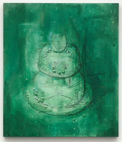
Ellen Gallangher is an African-Amercan artist who works with painting, drawing, film and video. Her ethnic background reflects a fair amount in her work. There is issues of race and racial stereotypes imposed by our society. I see Gallangher work a product of a lot research and investigation. She brings back images from the past and how it influenced the present as well her own personal view of subjects. Her experimentation and exploration with material results in unexpected results and I believe this is one of the aspects in her intentions. Gallangher brings her space and abstraction in working with elements, using cut outs, pasting, layering, printing, carving as well as video and sculputures. These are all aspects used to create a narrative. In her “Deluxe” work for example, she used cut outs of magazines from 1930′ through 1970′, glitter, gold leaf and coconut oil which is associate with african hair. This materials combined with collage and digital technology, show the meaning and importance of the african culture in America. Deluxe adresses questions of beauty, gender, changes, personal expression and cultural identity in sixty individually printed frames.
Deluxe by Ellen Gallagher 2004/05
Deluxe by Ellen Gallagher ,2004/05
In her work, Bird in hand 2006, is a poetic narrative with detailed and density to the story she tells. Ellen Gallangher rescues the past and retell stories through her perspective, exploring techniques in methods in art to deliver and engage interest in the viewers.
It is hard to view her paintings online. Gallangher’s work is composed by layers and different materials which might have a completely different impact seeing live. Online I enjoy the piece put together. I can see newspaper, cut out magazine photos, drawn lines and monochromatic combinations that fits the subject of African American culture.
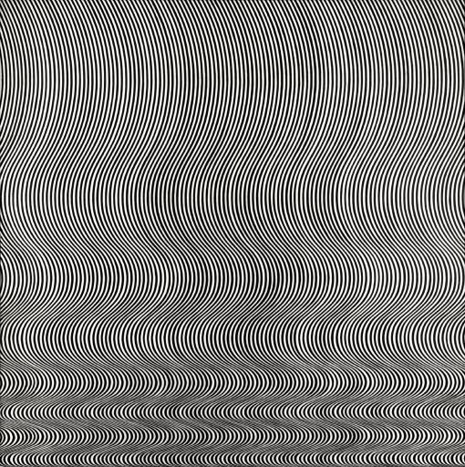
Bridget Riley is an English painter, know by her singular OP black and white paintings. Although Riley start with the pointillism technique, her later work was developed by drawings and painting that creates optical illusion. They are very meticulous work but for some reason, many of them seemed to have an hypnoctic effect, overwhelming and tiring for the eyes, specially the black and white ones. The coloured ones, presenting good combination caused me the sense of dizziness.
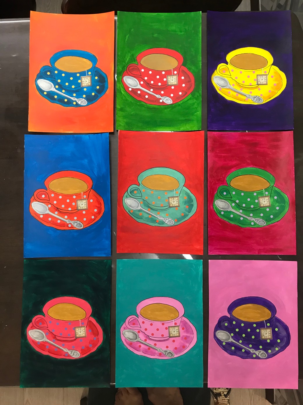
This Last assignment is a series inspired by Andy Warhol entitled : ‘ 9 cups of tea’. I have a first attempt to execute my idea on my PP tab but in the end, it didn’t resonate what I want to express. This is what I wanted. Bright bold colours, simple and feminine. That’s why I have chosen the tea cup object. It symbolises in paganism the Goddness womb. It is an object that reminds me my grandmother, mother and me as a mum. It was decorated in polka dots in homage to Yayoi Kusama, an artist I admire so much. I like when my art is very expressive but I also enjoy doing meticulous and carefully executed work. It brings me a good sense of effort and satisfaction . My first trial is also playful and colourful but I think my choice of using patterned background made it too busy. My stensils in thick black lines lacks the drawing element I wanted. I like them for being more diversified and fun but this last choice has more of context. In my critical review I have listed the artists who inspired me but this time my focus was Andy Warhol. Since we are on lockdown, the only way I managed to repeatedly copy the same tea cup was using a template of the image in baking paper. I copied it by re tracing the mark it leaves on the acrylic paint sheets. Each sheet is a A4 size, painted with acrylics and the tea bag detailed is a clock collage. It would have a better result and sofistication if painted on canvases and if I was able to go out, I might would try and finding out if the images could be printed on the canvas before painting, so it would be more uniform in terms of positioning and lines.
I am very pleased with this report. I have had a lot support from Diana Ali and she has helped me finding a direction to what resonates with me in my art. I followed all her advise and I have been reviewing some new and late work to make amendments or to keep using some elements that works well for me. There is always room for improvement and this module has been very insightful in terms of points about my art I have to consider such as in keep reasearching and linking my work to artists that inspire me , think more about context and increase the amount of sketches in order to come out with better work.
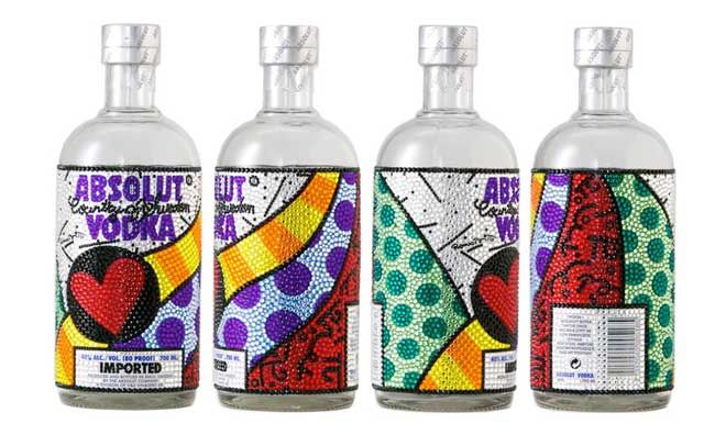
Romero Britto is a Brazilian artist, painter, serigrapher and sculptor, who lives in the USA since 1989. Coming from a very modest family from Pernambuco (Northeast of Brazil) he has developed a great sense of being creative using what was available around him, from cardboards, used paper and anything he could use for his artwork. Britto’s became known when the reinveted the bottle of absolut vodka. Millions of people saw that. His art is associated with pop art and cubism. Britto’s work is vibrant, busy and full of energy. Looking at his work is like looking at a Latino interpretation of Pop art blended with cubism. His work inspired me in the use of bright colours versus pattern.
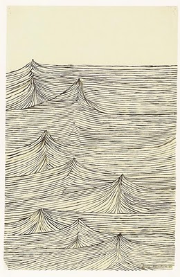
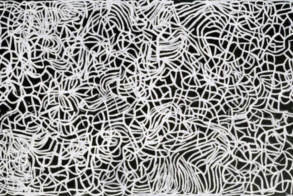
Louise Bourgeois was a French-American artist and sculptor who created a series of drawings called ‘Insonmia’. Her drawings were of shapes, human figure and also patterns. Red is a predominat colour in this series. Bourgeois is well known by her magnificent size sculpure called maman, a spider that represents her mum. She was a remarkable artist who succeeded in the art world during 1940′,50′ when it was mainly dominated by male artists. Among drawings, paintings, installations and sculptures, Bourgeois main subjects were family trauma, the feminine, sex… Her work has a intense presence of emotion and energy.
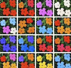
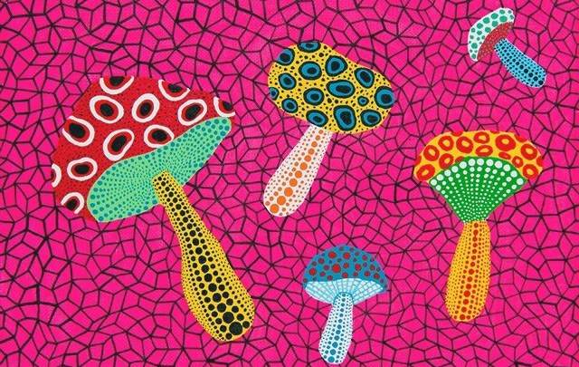
The other three artists who inspired me for this assignment are Yayoi Kusama , AndyWarhol and Emily Kame Kngwarreye. The research on these artists can be found on my PP post of ‘Researches on artists who work with repetition’ and Kngwarreye research is found in Contextual focus point, part 4, project 3.
Flower printing by Andy Warhol – 1964
work by Yayoi Kusama
Big Yam dream by Emily Kame Kngwarreye
Assigment five – Time lines, ‘Insomnia series’
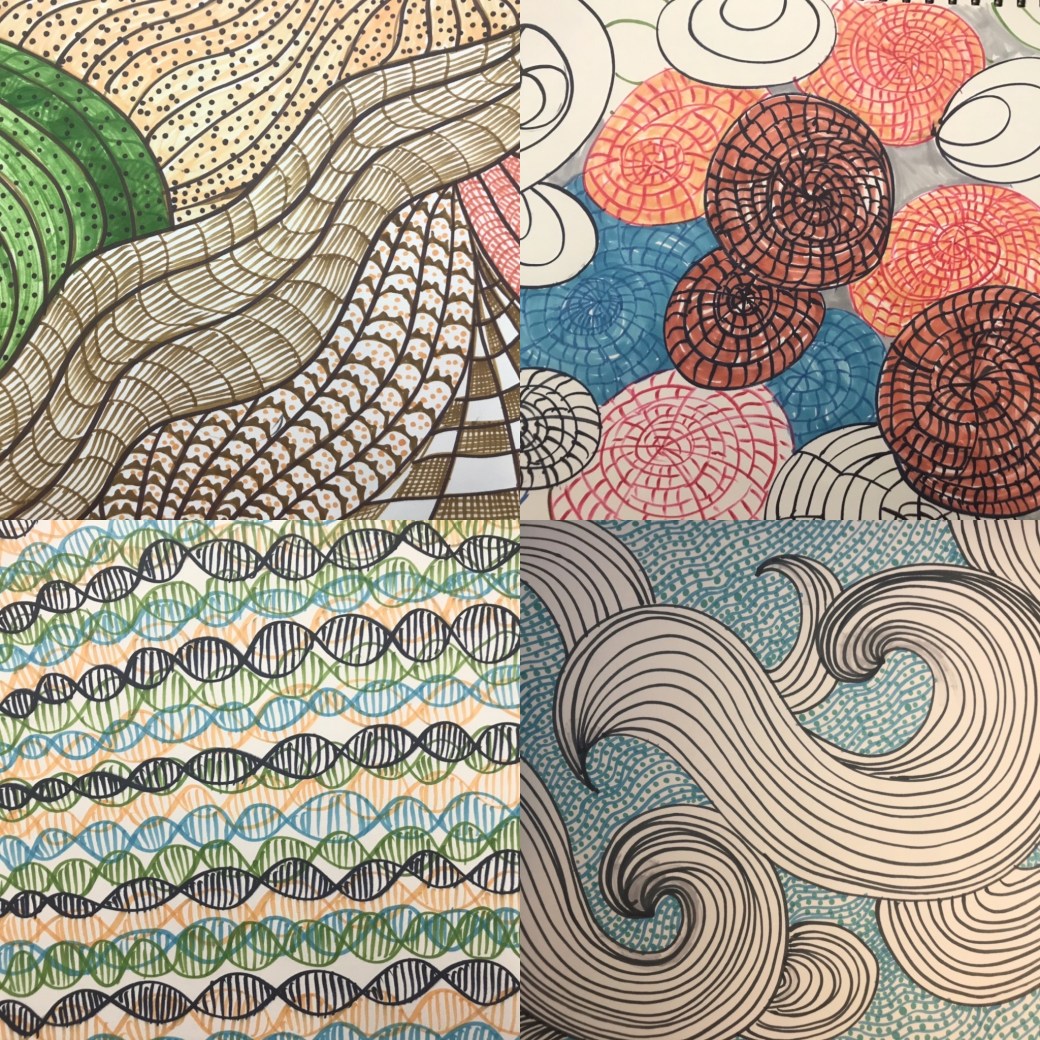
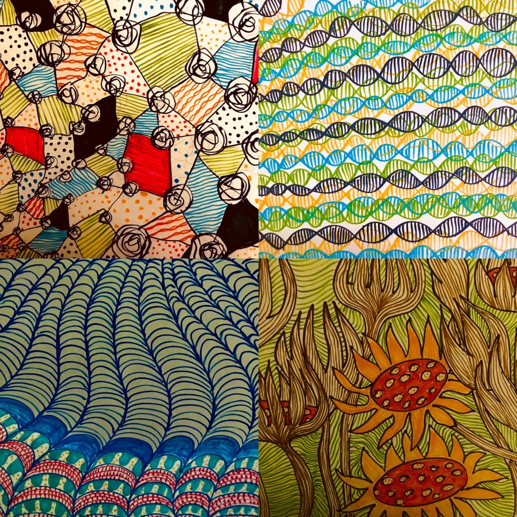
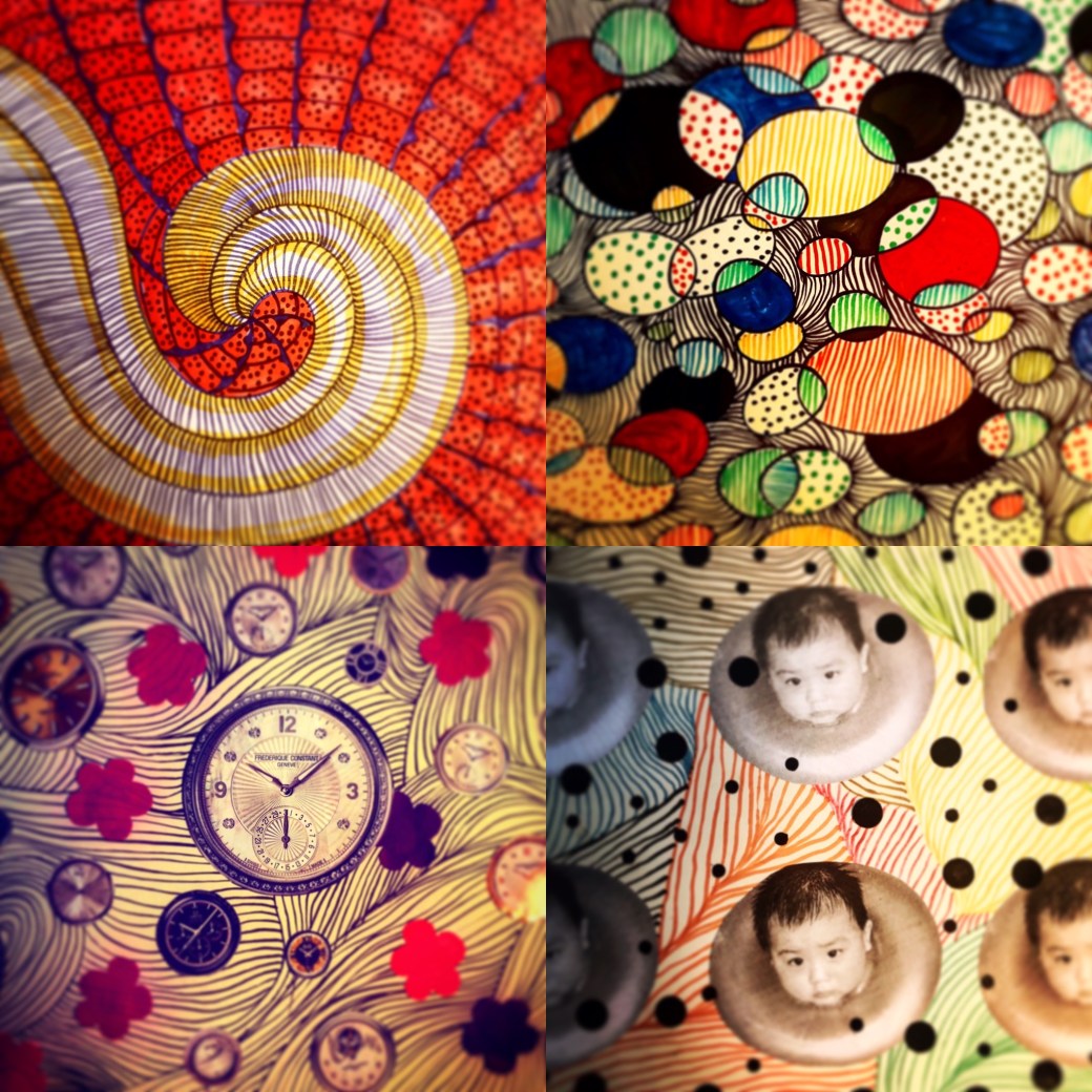
All these drawings are in size A3 sketch paper and canvas textured paper. The patterns were designed with markers, metallic paint,acrylic paint and cut out from coloured paper.
Reflection on Assignment five
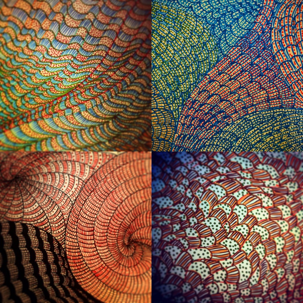
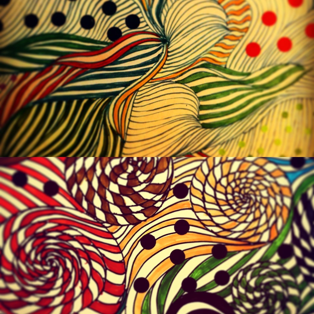
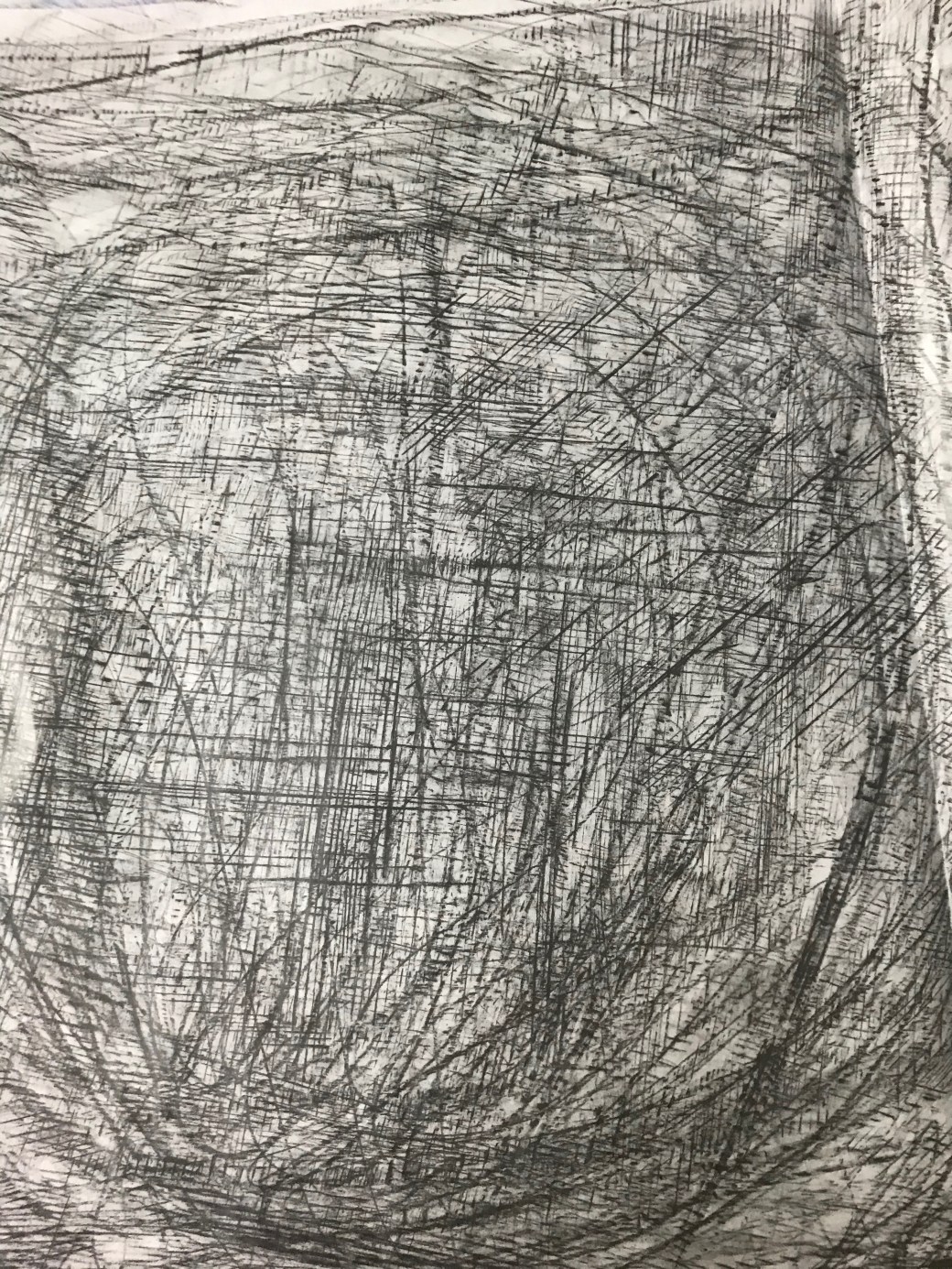
Being on lockdown has not been easy for anyone. I had made different plans for this Assignment but everything has changed since March 18th, when I became allowed to leave the house once a day to go for groceries. Part 5 of this module, was not an easy one to start with. The most difficult Project was Project 2: An artist’s book, however I received an excellent feedback from it! I might over think about some of the projects. Instead of just go with my guts, I cannot avoid worrying if I am meeting the success criteria in each task, and if I will achieve my credits to pass. I have even contacted my tutor Diana Ali to help me a bit more and she gave me great advise. It is not the first time she tells me not to overthink, and just do it, to not to follow the instructions in the module so strictly. After a lot research and reading about artist’s books, I think I finally decided to relax and keep doing, experimenting and exploring my ideas more freely. Despite the fact that I struggled to execute the first artist’s book, I found out how much pleasure is to do something that evolves through a certain period of time. I need to mention here that ‘Time’ is something that I have always craved for when it comes to my artwork, something that I never had enough due to day job, house chores and looking after my two children. At this moment, I have plenty of it and I want tobe as productive as I can . I had to mention Project 2 because after that it seemed that everything started to flow better. I finally passed that phase of being stuck and worried about doing the right thing. I just kept doing things, kept producing within the instructions I understood but bending these instructions slightly, to suit how I work. Using time to explore and create new work has proven to be very rewarding. Time to plan, time to try and make mistakes and time to execute it. The subject ‘time’ has also triggered many thoughts and ideas.Right at this moment in everyone’s life around the world, time has become so plenty and yet, threatening . My initial plan for Assignment 5 involved a construction site.I have recorded itthrough photos the last month or so. How I would executed it, I didn’t think much about. I was focused on a subject and literally in finding something that would ‘elapse’ over a certain amount of time. Now I can’t go out of my house to check on this site. I have photographed it, but I still wanted to go back and observe the final changes. I am home, stuck, with plenty of time on my hands to come out with something else I can do within my environment. Since the first day of lockdown I have become very anxious and restless. I feel for my children and family, I worry about the whole world and our future in it. I can’t sleep most nights. I am awake till 3am every day. The first couple nights I spent two hours just drawing. Not planning anything, until one night I started drawing patterns. The first one came out quite nicely.
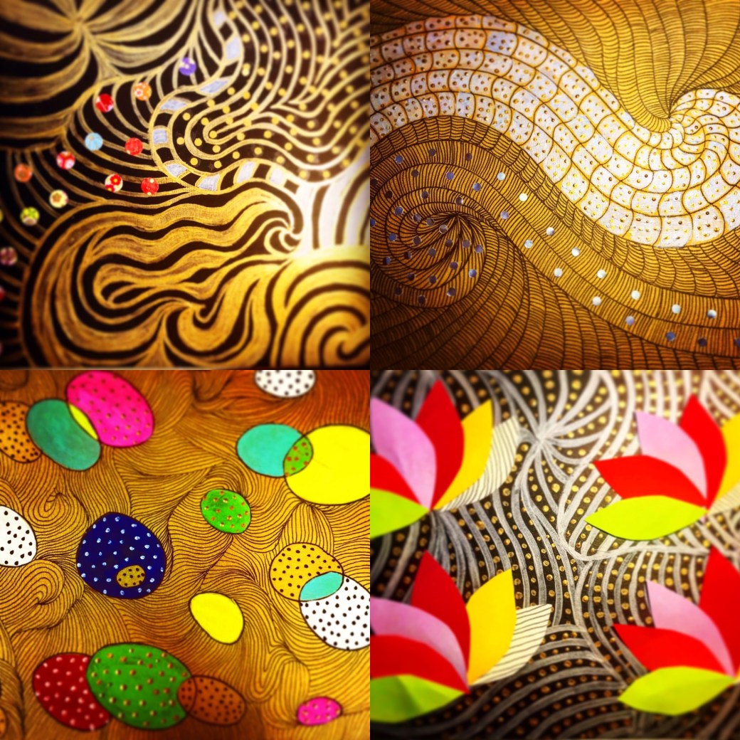
I just enjoyed doing these patterns, it relaxed meand I know in my subconscious it might have to do with my researches for my PP;to link my work to the work of Andy Warhol, Yayoi Kusama or Louise Borgeois and other artists who worked with ‘repetition’. Patterns is about repeating elements in an artwork and repetition has taken over my work and my everyday life , in a regimented way. It is not that we do not live in repeated moments .Most of us wake up everyday, and do very similar things to keep up our own routines. I suppose I have start perceiving ‘repetition’ in different angles . The repetition as in how Iwant to present my PP, which I will discuss when it is ready, but it also has taken another route for this Assignment in representing boredom, routine, consistency, subconscious thoughts, flow and as an emotional practise. Drawing patterns had become a way of dealing with my restlessness, the way Louise Bourgeois has used in her series of drawings called ‘Insomnia’. It became a way of exploring my ability in working with lines and creating different images with them. I have being inspired by Andy Warhol, Yayoi Kusama, Louise Bourgeois, Allan McCollum, Britto Romero and Emily Kame Kngwarreye. Some of these artist’sresearches can be found in my PP post. Louise Bourgeois, Emily Kame and Britto Romero will be included in this Assignment’s page.
I have developed a series called ‘Insomnia’, inspired by ‘Insomnia drawings’ by Louise Borgeois. I have started this series on the 18th of March.. Some are beautiful, others are boring, heavy, or too busy to look at. Some are conceptual and some purely emotional. Some are also unfinished as it all relates to how I was feeling on each day of sleepsness nights . I have tried them in different techniques, methods and materials. It has elapsed from simple patterns to more sophisticated and intriguing ones. I am presenting this Assignment five with 21 pieces of work. Overall, this course has helped me enhancing my abilities in working with different materials and techniques. It has broaden my knowledge in drawing and how to react and represent my ideas in relation to my environment, feelings and perception. I believe I am starting to find my voice in my work.
I am very pleased with this report, specially because I am coming to the end of this module. I completely understand Diana’s comment on trying not to make some drawing ‘pretty’ by colouring or making changes as sometimes they work as they are. It is true, I sill worry about doing something wrong and not seeing as a good work although I spontaneously do some work that seems that the spontaineity is exactly what is working! I am also glad I am improving in terms of context and concept. It is not completely clear yet, I don’t know If I can do it in every single work, but it makes more sense and it is better to work on something when I have in mind what I am trying to represent. My assignment was successful but I understand what Diana means by maybe adding some collage elements would make it look more interesting than be just patterns. I will take a look again and see how could I modify some of them. Overall, this is a good report and I am considering all the advises in order to improve for the next coming Assignment and Module.
Assignment five : Collage addition
I followed my tutor Diana Ali suggestion and add some collage elements to some of my pattern work. I think it made them more interesting rather than just pattern work.
Find a place of significance to you to create a site-specific artwork. Responding to features of the site, add a drawn element or select a found drawn element which you will extend to express something you find interesting about the site. Relate your art work to your research in your log and synthesise what you’ve learned about installation and environment art with your own interests.
Trials:
Final pieces:
Reflection on Assignment four:
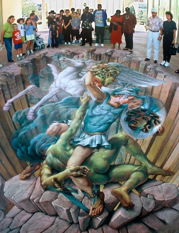
This Part was a very new experience. I find it very uncomfortable to work outdoors or look for sites I find interesting due to the weather in Southeast Asia. Project 3 (Installation) was more interesting and prepared me for this Assignment which, in the end, I really enjoyed. I was a bit apprehensive when I started going outdoors looking for sites and thinking what I wanted to find. I wanted to use my own drawings, I had a few that I really like, to interact with a real site . Using photograph and photographing places for a piece of artwork was something I have never done before. I went around my neighbourhood area and took photos of a few interesting places to work with. There are a lot of concrete surrounding the area where I live, and I wanted to add something fun or very colourful to make a contrast between the real grey world and an imaginary happy world. My favourite site was the alcove featured in one of the pillars under a flyover . As soon as I looked at it, I saw that something could be seeing on the other side of it. A secret passage or an imaginary door that would lead somewhere completely opposite of the concrete jungle around me. It is a typical urban site that pass me the feeling of being a dodgy place when it gets dark, somewhere that not many people would just hang around. I know it would be a lot easier if I had or knew how to use a drawing software, or it might be the same as it took me patience and time to cut figures, re scale images to fit the photograph, play around, photograph the images I like again and again, looking for the right time of the day and light. This experience made me think that photography is a quite fascinating practice. I enjoyed creating an image interacting an urban site with my drawings. I was inspired by the work of street artist Kurt Wenner and Edgar Mueller . I wanted to create fantasy and fun for the viewers to experience. Something to break the dulness of the concrete and make the site bright and attractive to look at. My favourite combination was adding my ‘creatures’ that I drew a long time ago for a children’s book story. They are special to me, I like how they make me giggle. They look cute and naughty at the same time as if they are always up for something.I decided to put them in other sites of photographs I took for this assignment. It is like I am telling a story. The street drain really worked well with some of them hiding behind the bushes. The least successful part I think was the one of the street lamp that I tried to makelook like a spaceship. Something didn’t quite fit like the other two images. Hand cutting just lacks that polished finishing that can be done digitally. Overall I enjoyed the process and I like the result. If I had to do anything differently I would like to learn and try to do it using any drawing software, to give it more accuracy and professional look. For instance, the shadows and layers should blend together in better ways. I think through this Assignment I gained a bit of knowledge in photography, how to see things with a different perception and how art can extend to places we live in a more ‘alive’ sort of ways. I would like to explore it more in my next pieces: the mix between photographed images and my own drawings.
Kurt Wenner is known by the artist who invented the 3D Street Art painting. He started his career as a scientific illustrator for NASA but left in 1981, sold all his belongings and moved to Italy to study figurative drawing and art from the great artists from the Renaissance. In 1991 he was commissioned to create a work of art to honor the visit of Pope John Paul II to the city of Mantua.
In the 2000’s he first introduced 3D pavement art at the Santa Barbara Museum of Art. Shortly after he founded the first street painting festival in the United States. Wenner has inspired hundreds of artists around the globe to create their own versions of street art.
He studied Anamorphism that existed in the 17th century but he created his own geometry method that he affirms is very unique from other artists.
Researches suggested on report 3: Yinka Shonibare
Yinka Shonibare MBE- ‘I’m the rebel within’ (2016) [user-generated content online] creat. TATE on 14 January 2016 at : https://youtu.be/WroXoWaGfL8 (accessed on February 2020)
Yinka Shonibare is a Nigerian- British artist who works with painting, sculptures , photography , installation and recently has been working with film and performance. Born in 1962 his working medium key is theAfrican motifs printed fabric in bright colours .Shonibare thinks artists at some point will ask themselves questions such as : What do I want to make? Where do I want to get? He describes his art as post-colonial hybrid.
Shonibare has always been a very versatile artist who changes all the time, always wanting to create something new.He produces conceptual art exploring politics, culture, history, philosophy and identity and the interrelationship between Africa and Europe. According to him these explorations broaden people’s awareness.
He states that in art school, you learn all sorts of techniques, methods and mediums . All these information can be very confusing and that is the reason he has adopt fusion in his style in art. Shonibare approaches art in a more poetic rather when didactic ways.
He founded a project in his studio in East London called “ Guest project”, which serves as a space for artists to experiment and fail. It involves around 150 artists. A platform for artistic to create their art becoming pro-active and taking ownership of where they want to take their art planning exhibitions, marketing and enterprising within themselves.
I find his art very ethic due to the use of colourful African patterns. It isbeautiful and dark ,with headless figures or globes replacing heads and a certain stillness in his installation but he also creates performance where movements describes his ideas. He definetely doesn’t limit himself to form and shape. Shonibare art is also very sophisticated usingthe colourful fabrics in colonial European outfits as a contrast of races, racism and history.Yinka Shonibare is not only an artist who creates and executesart in various ways butalso a collaborator in theart community with a project that makes art an endless cycle in life.
Micheal Readecher is a Dutch artist who works in London. Initially trained in fashion designer, he combines the traditional craft of needlework with the successful history of painting. Readecker work has many aspects of domesticity in working with fabrics, sticking and embroidery. He is a very experimental artist, using craft material and blending it with his interesting combinations of colours and imagery. I think Readecker reaches the right balance in his tonal range in his monochromatic paintings. The lighting, softness and smooth look blended with stitched details, forms simple and intriguing compositions with a touch of texture of fabric, thread or embroidery.
John Michael Craig Martin is an Irish -born (in 1941) conceptual, contemporary artist and painter. Martin grew up and studied in the United States but lives and works in London since 1966. In the late 1970′ he started line drawing of ordinary objects. His central idea in his art is the relationship and tension between objects, representation and language. In 1990′ he made a decisive shift in using bold outlines, vibrant colours in flat, clear representation. Through exacting draftsmanship, he uses composition to explore spatial relationships by juxtaposing and layering color. Martin is interested in ordinary objects and the purpose of them. He intended to abstain from style using tape to draw objects without having his own drawing style, doing it by hand and yet, it became his style. He brings out in every ordinary object the beauty and the function of it in using vibrant colours . These colours make them stand out almost as they are alive characters, but not in a cartoony way because it is elegantly traced with its real features .They as represented exactly as they are. Michael Craig Martin gives us a different perception of everyday ordinary objects most people possess, in a energetic and impacting way. His very intriguing work might be ‘Oak tree’. A glass of water placed on the shelf which in the proof of that impossibility, it also deals with language, meaning and what we created and give name in our minds. The preconception we have about material things. It questions our belief in things around us.
Elizabeth Peyton : Faces contains their time (2015) [user-generated content online] Creat. Lousiana Channel on 09 November 2015 at: https://youtu.be/3Hwl1l_j2vE (accessed on 16th Feb 2020)
John Lennon (1965) by Elizabeth Peyton in 1990′
Elizabeth Peyton is an American artist born in 1965 . She is known by her small scale portraits of friends, celebrities and historical figures. Her painting has a transparency and her strokes varies from watery to deep, visible shapes and shades.She works from photography, printing or live models.
“Peyton’s portraits, distinct in their female gaze, explore contemporary concepts of identity, sexuality, and beauty using similar techniques and styles that have become de rigueur in modern fashion illustration. Men and women become elongated and androgynous, blushed with feminine hues, evolving and reviving the Romanticism of 18th and 19th century British portraiture. ” (theartstory.org)
The Paragraph above describe in specific words my first impressions of Peyton’s portraits. An androgynous and very feminine feel is one of the uniqueness in her style.
I think the differential in Peyton’s portraits is not the fact that she only portrays the subject but she puts how she feels about the subject and the time it is happening. It is not static faces,but it feels as a scene from a movie or situation we see when observing people. They are emotional and gives a sense of place and energy in the ways she uses her brush strokes, colours, lighting, angles and background. The time represented in her paintings shows our fascination for beauty in the old days to modern, social media oriented life style. The intriguing behaviour of creating intimacy with people we only know from afar.
I was so glad to hear that my Assignment 4 was successful! This part had it’s big ups and downs. Working with outdoors environment was really hard and I don’t think I did or do well. I tried my best and I still tend to take the projects explained on the module to literally. It is a difficult situation and part of long distance learning. I rely mostly on my own understanding of what I read. I am also glad that my researches went well. Diana gave me a good reminder of relating my work to the artists I have been learning about. I must keep it in mind in the next coming projects. Overall, I am really taking into consideration comments such as : take ownership of the projects, turn it around to resonate to me more. I need to lose the fear of doing something wrong! When I put all my heart in my artwork, when I draw what really gives me joy, the result tends to be a successful one. Assignment 4 proved it. Next part I will do more work per project, dig into what really inspires me, relate my work to the artists I have been searching and start defining what I want and how to present my PP.
Relaxing Classical Cello music solo soothing, instrumental background [user generated content online] creat. Frank Graffney on 7 june 2017 ( Accessed on 6 Jan 2020) at: https://youtu.be/XuSEl9OiQ_Y
Select a piece of music and allow your movements to be affected or generated by it whilst producing a drawing. To begin with produce lines and marks solely in response to the music. After, develop this further. For example, you could introduce an observational element such as a self-portraiture and begin to explore the interplay between gesture and representation.
Preparatory work piece and final piece :
Reflection: Assignment three
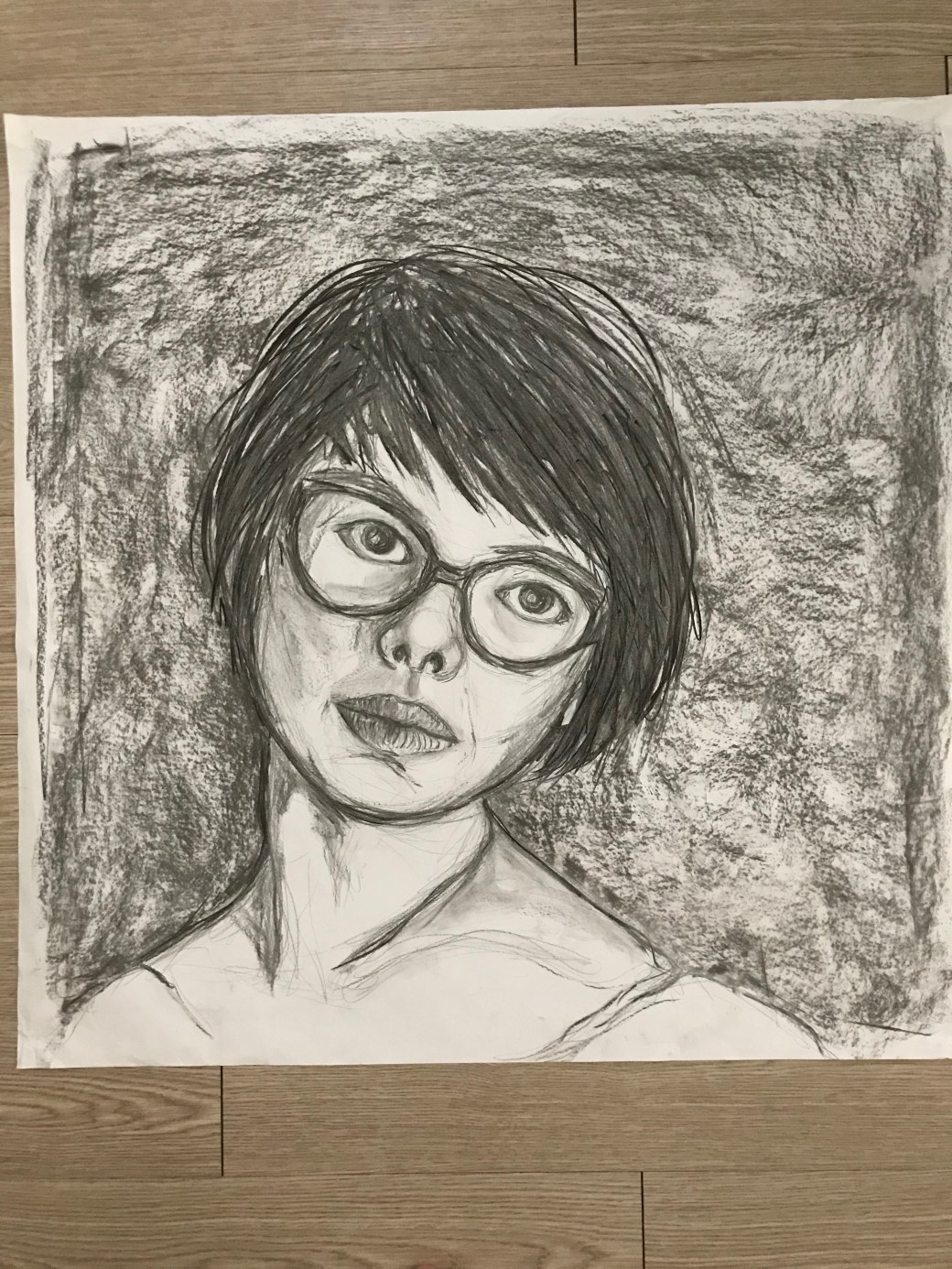
I have tried a few times to get inspired by listening to music. I usually like to make unconscious drawing listening to instrumental music, and the result has been always very dramatic and emotional. When I work this way I even try to close my eyes times to times, to just have my hands moving according to the rhythm. Through Part Three I had explored and experienced new ways to approach drawing. In Drawing blind, I had a lot fluidity and spontaneity, probably because with my eyes closed I can’t control how the marks will affect the final drawing. Experimenting with mark-making is something I always wanted to explore as I am very keen on big scale pieces. I also enjoy losing control when the scale is large and I just have to let the media finish the job itself without worrying with small details. Drawing machines was my least favorite but taught me again to experiment something out of my control and made me think of drawing in a very unsual wasy. An emotional response was difficult for me to let flow . Reading the sentences and knowing the intention of the outcome for the exercise, blocked my fluidity and spontaineity. I think Assignment three was just another step to investigate how my drawings changes according to the approach, methods, techniques and materials I use. My self-portraiture for this assignment is far from being accurate. It is a bit out of proportion and maybe a bit stiff, but my mark making, can tell there was afair amount of movements when it was done. I think the fact that I chose to introduce the observational element and at the same time kept my natural flow, influenced in how I portrayed myself. The mark-making has flow and emotion but the image itself is static as I found it is hard to let it flow and observe at the same time. I think my preparatory exercise describes more the rhythm and movement .During the exercise I focused on the music and drawing was a secondary act. When I did the self portrait I was trying to concentrate in representing my own image without losing those movements, and that became a bit difficult and less unconscious. I would like to find out how to draw an abstract object, figure, observing but also letting the flow of mark making taking over.
Overall, part three gave me the ability to extend the possibilities of drawing. In project one, ‘Drawing blind’ I could feel in a similar way that the artist William Anastasi act in his ‘Blind drawings’ the only difference is that he didn’t try to describe anything by touching. Project 2, ‘Mark-making gave me a slightest taste of what Rebecca Horn tried in Her work ‘Fingers’ 1974 when she drew with gloves attached to sticks to elongate her fingers. Project three, Drawing machine was also a trial on how she built and connect the act of drawing with machines. I think in the Assignment I had my perception of drawing changed and my senses were more stimulated and acted, consciously versus unconsciously in what I was doing, using my feelings influenced by what I was listening, the touch of the material I used switching between graffiti and charcoal, using more and less pressure depending on the areas of the drawing. I had to work hard on how to look at it and scale on a big size. I moved my whole body around the paper do add some details, shadows and sense of depth. I like the result and if I could change anything I would like to have a try in bigger scale, very large size piece to really dance around the paper, losing a bit more control and have a more abstract result. I am still struggiling between finding what kind of expression feel right when I am drawing and what I like to develop at the end of this module.
Interesting to hear that my larger drawing and lose mark making gives more personality to my work. I enjoyed working in large scale, I think I would love to work in large scale more, but at the moment, I lack space bigger pieces. The little I did for this project felt a bit intimidating and yet the sense of freedom was rewarding. I should have tried different mediums, I guess I stick with grafite, pencil and charcoal because they might be my comfort zone mediums. I will try to be more risk and experimental in the next coming parts/projects. I thought I needed to do a piece of work per project but again, the module does not stipulate numbers and I will try to do more work per project in the future.
Make a drawing of a subject of your choice using the subject itself or tools constructed from the subject, dipped in ink or paint.
Sketch book ideas:
Final Pieces :
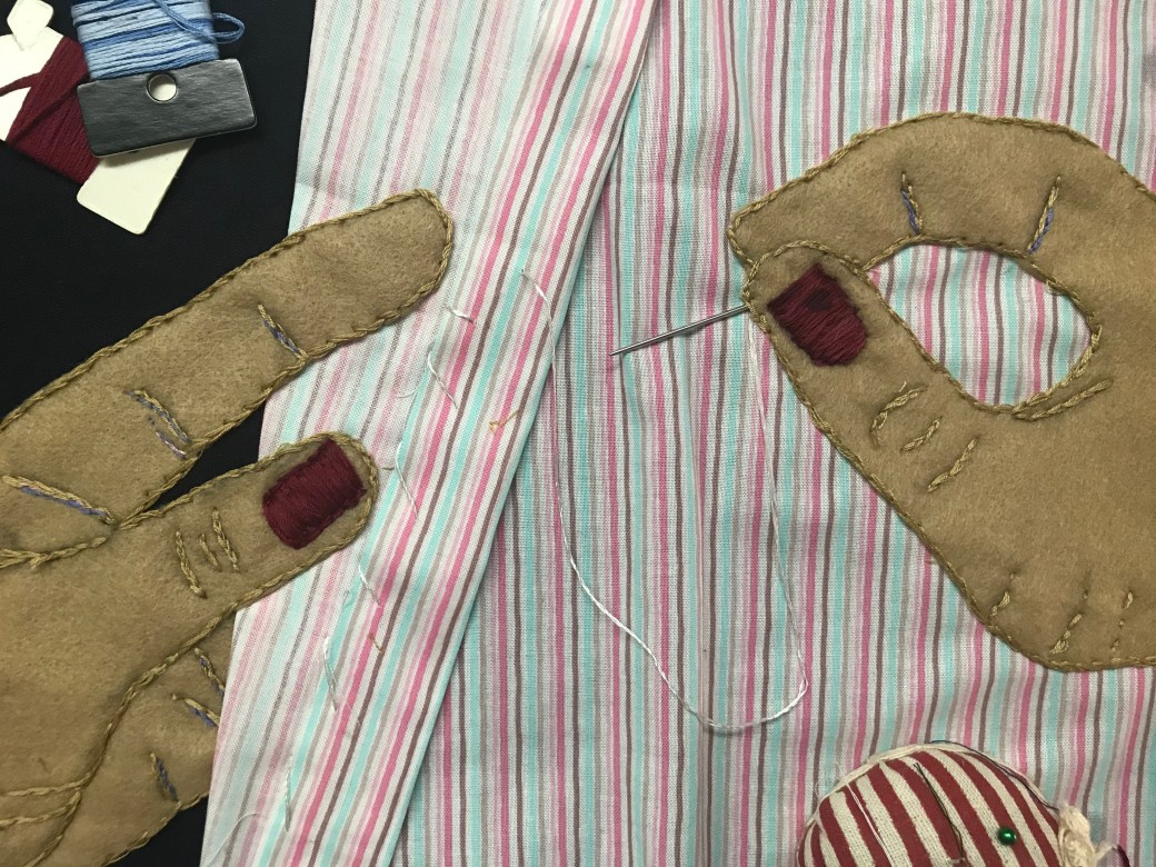
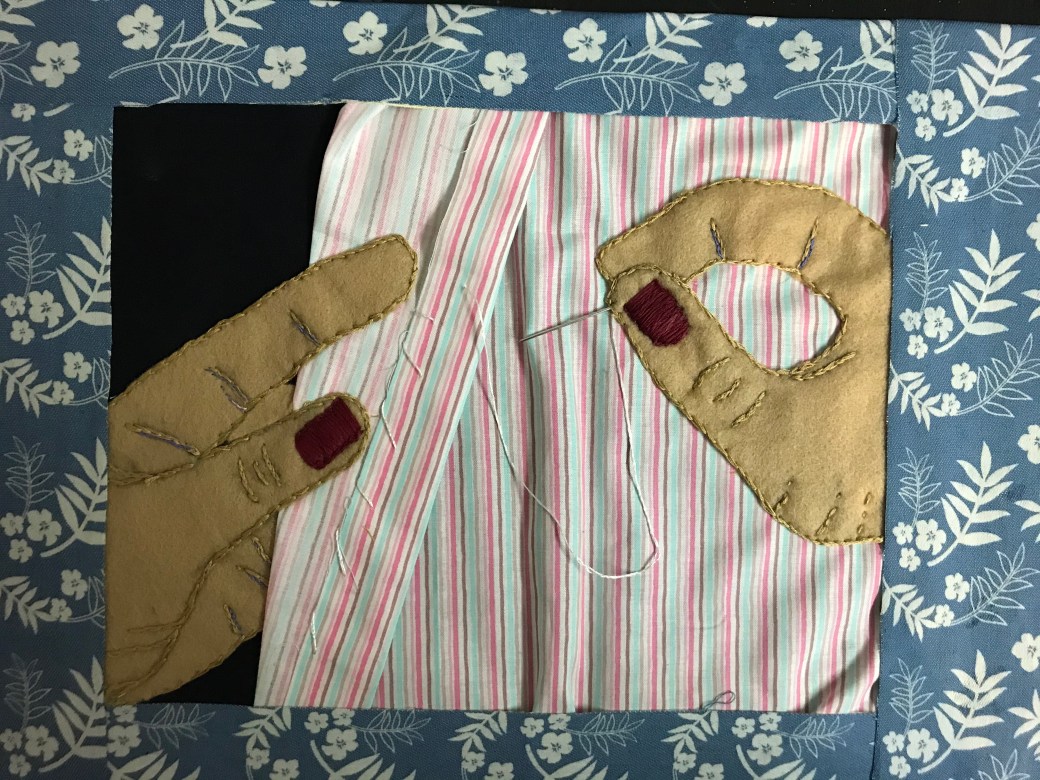
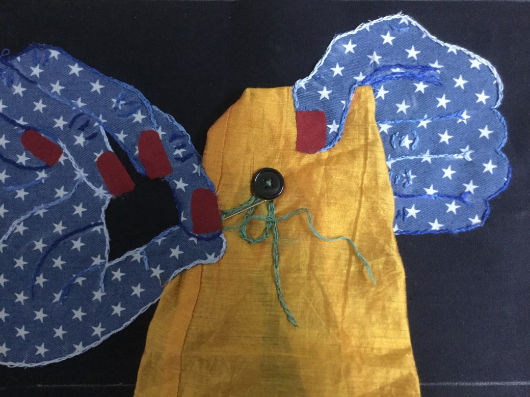
sewing hand – sewed with felt and cotton
Sewing hand2- sewed with cotton and silk
Reflection on Assignment 2:
The decision on this Assignment came very unexpected. Before I even start sketching, I have ideas, many of them. Sometimes, I go to bed thinking of all of them, sketching in my mind. Then I decide which ones I would like to test, how would it be possible and what I need for it. It has been a very long time, but I have always being fascinated by sewing. As a small child I use to watch my eldest sister knitting and doing crochet. She taught me a bit of crochet and I loved it .Looking at the basket full of soft and coloured threads were so beautiful to me. My mum had an old Singer sewing machine at home, it was very precious thing to her,no one could touch it. She was very skilful using it and made us clothes and many amendments of things we didn’t like as it was. I have always enjoyed looking at the coloured thread bobbings ,pins, needles, different textiles and the noise a sewing machine makes .She used to always give me pieces of left over textiles and I made a few ‘clothes’ for my dolls. I liked the buttons and zippers and even followed her to what we call ‘armarinhos’ in Brazil, where you buy anything related to sewing. It is a childhood memory and I left it there. Back a few years ago I followed a friend to a textile shop, she was also a very skilful person with sewing, and had starting with upholstery items for her new home. Again, everything in the shop fascinated me, specially the amount of different textiles. I wished I could sew things, choose textiles and material, use a sewing machine, but I didn’t know how, never gave it a try. I don’t want to make clothes or amendments and nor I wish to do upholstery items. I have NEVER consider doing art with textiles and sewing! At the moment I ask myself: Why not? Then I discovered the artist Grayson Perry in EDM module. He works with tapestry. His methods are very advanced but his art work pieces are big tapestry of colourful images with many messages and strong concepts . It is moremade out of embroidery and he has his ideas digitalised before execute each work. I also found about Njideka Crosby, a Nigerian-American artist who adds traditional Nigerian fabrics in her artwork among many other artist who uses textiles in various ways and styles. I decided I wanted to do a sewing piece of work by sewing it myself. I sketched a few drawings of what image I wanted to sew. I have only very basic skills in doing it but I rediscover a new passion to apply to my art: textiles. It feels so refreshing finding out ways beyond traditional art materials and tools, and is so engaging knowing that I can improve andchallenge myself with something new. Working with the material of the subject itself was very rewarding. I have had a very enhancing experience in this assignment. It is simple and very basic but I definitely will try more, learn more and I am seriously considering purchasing a sewing machine. It is satisfying figuring out that I do not need to be a clothes designer, amendments lady or upholstery expert to work with textiles. I can use textiles to draw!
I have to say that I felt a bit disappointed with the comments on Assignment 2. Not because I do not agree with my tutor, I completely understand what she meant by it being ‘tamed’ in the sense of disciplined, restricted. I am trying to go out of my comfort zone, following her advice as in making mistakes. I try, but somehow I still worry about doing something completely wrong or not matching the sucess criteria requirements. I know it could have looked more interesting if I took more risks, making drawings over it, or using thread to draw instead of sewing. I took it too literally and it didn’t quite work well as an outcome. I still don’t have much discernment between what is expressive and spontaneous or what is a bit too messy and don’t work well visually. I only see what went well and what went wrong after I have a session with my tutor. Despite the comments on Assignment 2, Diana Ali gave me many positive suggestions about what my strenghts are and how I could improve them. I want to try to be more expressive with my work, I work well with charcoal and I might try another piece with it. I am sketching and thinking a lot about my PP and keeping it simple, be spontaneous, maybe use a bit of repetition which could really work in the project. I like bright flat colours and clear, simple images as much as I like busy scenes. Food for thought for now.
Final work for Assignment one: ‘A series of compositions in different backgrounds ‘
This slideshow requires JavaScript.
Assignment one – Reflection
For this assignment I was inspired by the work of Elizabeth Blackadder. My affinity with some of her work comes from my interest in Japanese objects. I am not a collector of objects because I am trying to adopt a minimalistic life style, but I have a few very special Japanese objects that holds emotional meaning to me. I initially had in mind cropping an image, but in the end I also liked some of the compositions from my sketch book. Through this assignment I tried to use bright colours in similar ways that Blackadder and Matisse do. I wanted to make an interesting use of space and composition with the objects, create a balance between the background and objects . I also wanted to keep it simple and chose just some objects rather than too many as in some of Blackadder work pieces. Cropping and start drawing from outside to inside the paper were some the new and interesting experiments I had in Part 1. My first attempt was… ok, just ok. I like the brightness of acrylic paint but I found difficult to work in the details.The result of this piece is a bit stiff, methodically done kind of work, and this is not how I wish my art to be. I like the colours, how I cropped the image and the use of space, but I wanted to have more fun, I needed to think of other ways I could work based on my initial ideas and sketches.Since this module is about ‘investigating drawing’ ,I want to try new possibilities, new ways of working with composition, colours, space and background. My second attempt was using watercolours which I am very confident with. The objects I chose feels good in watercolour for its softness and delicate notes. On the other hand, if I just had finished a composition in watercolour, that would be it. A drawing in watercolour. I wanted more, I didn’t know what yet. I liked a few ways of working with compositions, I couldn’t chose only one of my sketches. I also didn’t want to have many pieces for this first assignment. I wasn’t sure what I was trying to achieve and I know there is that moment when I look at a piece I have been working on and I can say : that is it, I have finished it, and I wasn’t there yet. My main concern was the background. I was looking for it in Japanese motifs….I tried in acrylics, collage, photos… and then I had an experiment. I cut the objects out, I tried one composition on a piece of Japanese fabric (the one I use for reference in my sketches). I took many pictures changing the position of the objects around. I tried a different fabric. I tried other surfaces around the house, different textures and colours. It became a series of compositions in different backgrounds! Looking through the photos I came to that point. I could say: ‘That is it’, my assignment one is a series of compositions in various background. It was an experiment and investigation and I learned to go beyond what I am still doing at times: try to finish a piece in a certain, technique or method. I want to explore and experiment more and more from now on.
This report helped me to go back and revise some points for improvement. I entirely agree with the comment of my bottle in the assignment being ‘wonky’, I will definetely do a new drawing. It was very motivating to hear about my abstract kitchen utensils and althoug I like ‘abstraction’, I struggle to define things without many details. In Project 2 ‘Using space’ I tried something different, leaving a lot space on purpose, but apparently it didn’t work. I will revise Project 2 as well. Overall, this report helps to keep in mind points for improvement for next Assignment, gives me good feedback about where it is going well and where I could go further and improve. I am glad my sketch book is working well and I am very motivated in keep developing my parallel project on ‘domestic life’ as the subject for it.