Project 3: Installation

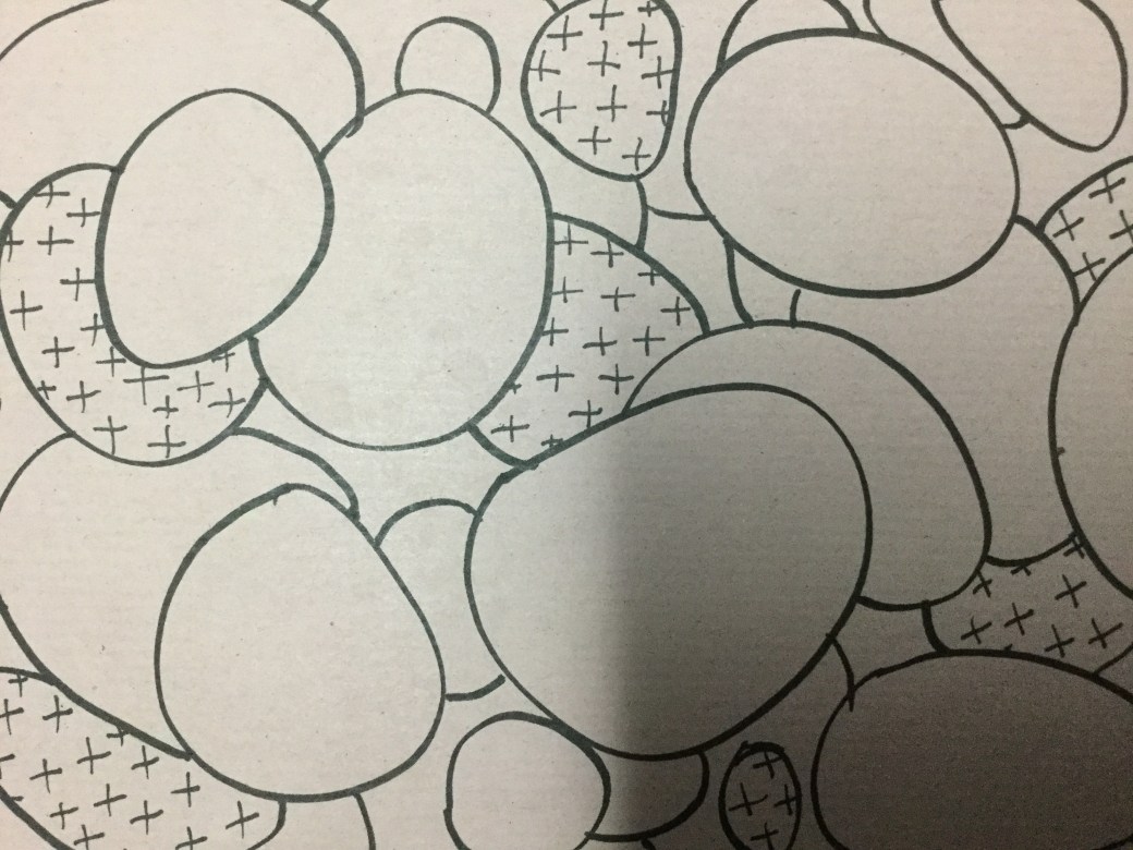
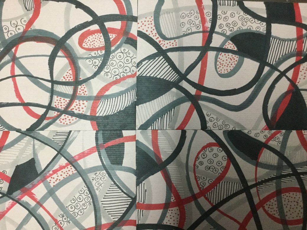
Method: Make a drawing that realtes to its environment in a way that creates and interesting dynamic between the artwork and the space around it. Think about ways that drawings could take part in a kind of dialogue with the space they inhabit. Text might be one way, or drawn object in partnership with its real world equivalent. A drawing of flowers might be positioned behind a vase. A drawing might be used to ‘join up’ the view between two windows.

IMG_1457D5AC236C-C9BD-4290-9665-B47B33CD08B2

IMG_8323


Reflection on Pierrete Bloch and Edward Krasinski

https://galerie-karsten-greve.com/en

http://www.artspace.com/pierrette-bloch

Pierrete Bloch was a Swiss French artist born in 1928 and considered one of the most renowed artist of Post-war Abstraction. She used  materials such as ink, charcoal, pencil, mesh and horse hair. The description of her using ‘poor material’ could be the fact that her work is unpretentious, transmiting only the pure essence of her artistic endeveaours achieving rhythm, fluidity and simplicity. The term ‘poor’ suits her work as in modest. The choice of black and white and repetition, continuity of lines and forms depicting space and time were explored in various unique ways with materials such as horse hair,creating linear drawing or  sculptures. The use of  mesh on canvas gave texture and weight to one of her art pieces. Her choice of materials lend to her subject the lines and natural shape.Bloch just let the material evolved with little or no intervention in the process. Her action seems to let the material act itself and she just respond to how it appeared by applying  less or more pressure when using ink, charcoal or pencil to repeat  forms, shapes or lines that surged as in a dialogue like a dance or music. Her gestural creativity and free expression resulted in powerful but soft pieces, almost as if it is writing art . As an admirer of Cy Tombly’s work, Pierrete Bloch’s work brings me the similar feeling of spontaneity, simplicity, innocence   and affirmation in her work.

Edward Krasinski (2001) ‘Untitled ‘ – TATE ( acessed in January 2020) at: https://www.tate.org.uk/art/artworks/krasinski-untitled-t12558  

krasinskimirrors

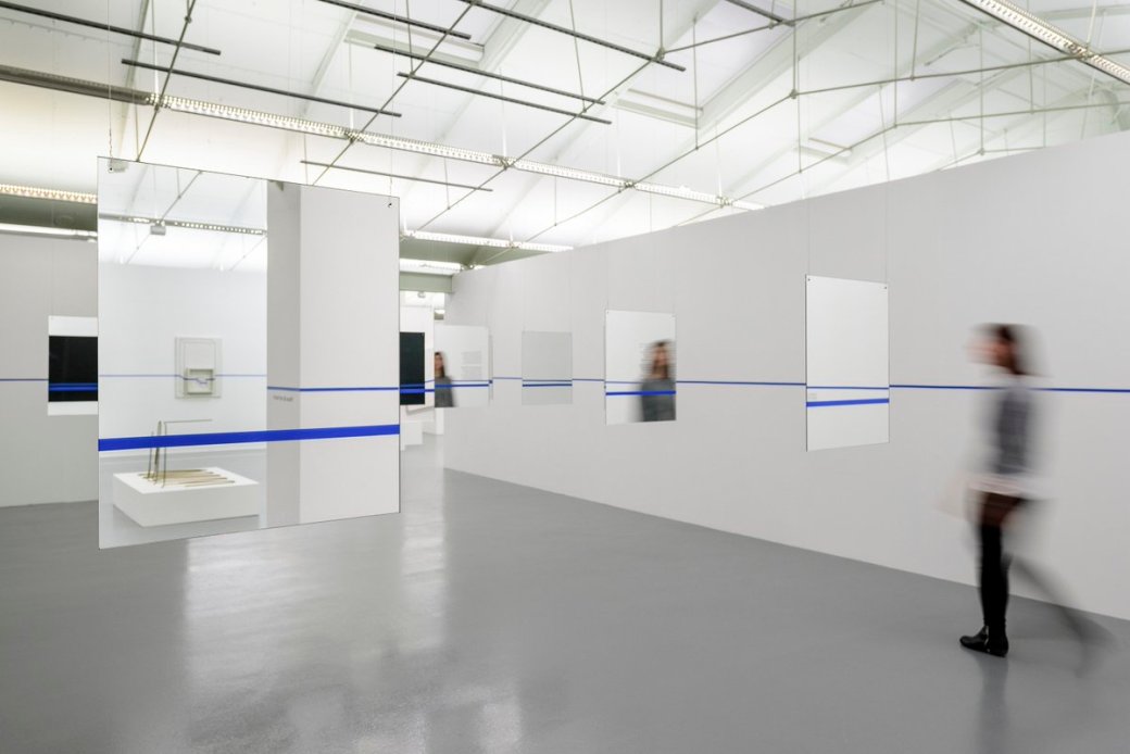
Untitled – Liverpool Tate in 2001 by Edward Krasinski

Edward Krasinski was a Polish artist born in 1925. He was also another post-war conceptual artist. Krasinski started his career as an Illustrator and after marrying an art critic he decided to dedicate himself fully to art. He started sculpultures, simple, minimalistic ones. In August 1969 he started his installations with the ‘blue tape’ and it became his trademark. He attached it on everything on his way from furnitures to places and paintings. He never had a clear explanation of the meaning for the blue tape, he let it explained itself since it became part of his installations. I think It could be related to  ‘time line’, ‘continuity’ to blue veins? The viewers can decide it.

Maman sculpture at wikipedia accessed on January 2020 at: https://en.wikipedia.org/wiki/Maman_(sculpture)

Louise Bourgeois, French -American  artist born in 1911.Borgeois is known for her many sculptures, one of the biggest called Maman, measuring 30ft high and  33ft wide. Her family worked with tapestry hence the symbology of a spider representing her mother as well as meaning nurturing and protective.  Borgeois always explored a variety of themes such as : domesticity and the family, sexuality and the body, death and the unconscious . The momument Maman started in 1947 as a series of ink and charcoal drawings and became a sculputure in 1996. Like most of Borgeois sculputures, they all started as sketches/drawings before becaming a 3D shaped pieces.

Contextual focus point : Emily Kame Kngwarreye

Emily Kame Kngwarreye (2014) women’s archive project at: http://www.womenaustralia.info/leaders/biogs/WLE0669b.htm ( accessed on January 2020)

my-country-4f5fef6390ac7

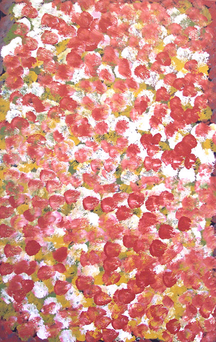
My country – 1994 by Emily Kame Kngwarreye

large

Yam multi colour – 1995 by Emily Kame Kngwarreye

Emily Kame was an indigenous Australia painter born in 1910 in the community of Utopia in the Northern Territory. She only became famous by the time she was 80 years old. During her very short carrer as an artist,  she changed her style many times. From small to bigger dots, lines,patterns and sizes. Her work is organic and cultural. It is part of her identity in her community. The use of the root ‘Yam” as theme in many of her paintings shows her connection to her people and how meaningful Yam was to them. Emily painted with her heart and soul, her work is intriguing, colourful and at the same time very harmonic.  The use of black background in most of her work creates a sense of dimension almost in 3D perspective. The repetition of lines and dots are continuous as in life source of time, a time that keeps going, no ends, no drama or extreme changes in mark making. It is consistent and drags the viewer attention to wonder over it again and again. There is a fine line between her work being drawing or paintings. In my opinion they are more of paintings because of the tools she use to do it and the non planned, on the go approach, similar to Jackson Pollock, with emotional flow and letting the material works its own ways.

Reflection: The importance of place and belonging for you in your own work.

Opposite than Emily Kame, I never had consistency or cultural strength in life. I have always wanted to draw and paint as a child and was constantly pulled away from it with the affirmation that Art and being an artist could only be a hobby. I stopped drawing during my 20′ and 30′, trying to be interested in something else that would help me have a career and make money. I was brought up in a beautiful country – Brasil , with a lively and warm culture but at home I was hightly influenced by the Japanese culture. Sense of belonging is not something easy for me to define. I feel torn between the two cultures. Most of my adult life was far from my home country and now as an adult, trying to become an artist I  still struggle  finding my voice in Art. I have wanted to be a children’s book illustrator for so many years and it didn’t happen. I made some money being commissioned for portraits but I never had any passion for doing it. Since I start this course I have learned so much and there are so many things, styles and techniques I like but it is still not defined in my own work. Through the PP I am trying to come out with something more consistent and using my strenghts to achieve it. I definitely like bright, bold colours. I like simple but I enjoy messy and lose mark making as well. Drawing my surroundings and everyday subjects/objects I interact with is what most interest me at the moment. I think place is more important to me than belonging at the moment.


Advertisement

Project 2: Interacting with the environment

Aim: Drawing in a favourite or inspiring place can be very rewarding, but a great deal of translation goes on – in terms of scale, for example, as well as the information from other senses than the visual which is harder to convey. Creating a site-specific artwork enables the artist to manipulate the participant’s experience of the actual environment, rather than presenting a simulacrum in two dimensions for the spectator to reconstitute imaginatively, or a remnant left over from the artist’s own experience.

Method: Take a walk in a place you know well and make five different small drawn interactions in the environment using only what you find around you and your own body and without damaging any plants or animals in the process. Try to do things which will affect the way a visitor to the space would perceive it, either by directing their gaze or by changing the qualities of the place. Look at the work of Andy Goldsworthy and reflect on how he uses his own body and movements and the way he emphasises his own involvement in balance with the natural material he uses. If you prefer, you can translate this project into an urban setting, but be careful not to commit any acts of vandalism. Arm yourself with a decent camera so that you can record your work.


IMG_0551

Reflection: Interacting with the environment

I live in a very urban environment and I do not know how I could interact with it. I don’t like it. I feel mostly comfortable and at peace confined in my home space. My outdoors space is noisy, busy and very suffocating, but I have no choice. There is nowhere I could move things around and I could not think of anything or anywhere I could make drawings. It was very frustrating. In the end I found the playground in my apartament building complex and although there is not much nature around, I managed to work with what I found. The feeling of manipulate natural objects is very good. Working with the organic, colours and shapes, using only my hands to arrange them is being part of the finished product. I wish I could have access to the woods or a bigger space with more nature around me to explore. I have experienced natural sites in the UK, Japan and Brasil. Malaysia has plenty of it but I live in the middle of the capital city of Kuala Lumpur,  in an very urban area . I don’t drive and I can’t afford to go anywhere at the moment. The beach is another place that I think I could manage to do a lot.  I hope I can get somewhere by the end of this module so I can add something more interesting to this project. Making art in nature can be rewarding and frustrating. Maybe depending on the space and viewers the work can be appreciated before ‘nature’ takes it away, but in the city, people don’t seem to take the time to look of what is not man made as much, they don’t appreciate or look after their environment . The flower I made in the playground was quite big scale and took me nearly an hour. The problem working outdoors here is because it is very hot and humid with mosquitoes pestering you all the time. I like my finished product and after taking the photos I sat in a bench thinking about what else around me I could use to create a new drawing. Two kids came straight after and although the comment of one of them was nice : Look! it is a flower made with different coloured leaves! They soon decided to just step and kick it, with the parent nearby who could at least motivate them to appreciate it a bit more or maybe even having a go doing something…. but he was too busy on the phone.Sad times of the urban modern days.

Andy Goldsworthy, artnet.com at: http://www.artnet.com/artists/andy-goldsworthy/ ( accessed on February 2020)


We share a connection with  Stone ( 2011) – TATE shots [user generated content online] creat. Tate on 01 december 2011 at: https://youtu.be/9DjCMqtJr0Q (accessed in February 2020)

Andy Goldsworthy is a British sculptor , photographer and environmentalist who works with natural material in natural and urban settings. He arrange and rearrange things such as flowers, twigs, stones, wood and mud in almost a poetic way. His concept is mostly about nature, us as part of it and the inevitable death and decay as part of the life cycle. His art has a minimalist aesthetic aspect in simple motifs includying circles, snaking lines, spirals and holes. The passage of time and eventual dissolution is central to Goldsworthy work. He rejects the idea of art as a commodity to be exhibited and sold. He is interested in the social history of the land on which he is working and that includes its human population. he feels it is important to acknowledge the site’s history and the various connection with the people from that land. I think Andy Goldsworthy work is a very organic and draw attention to environmental preservation and protection. He shows the need of making and release his own art as almost a religious believe in creating and let nature take care of it. Goldsworthy’s ideas and projects play a very important role of  art bringing awareness about our endangered enviroment these days and raise a new generation of spectators and artists to work towards valueing and preserve natural sites for the generations to come. Being a participant in the process of making art like he does is the essence of his work.

Project 1 : Found images

Aim: The aim of this exercise is to open up your mind to new possibilites in terms of understanding what line can be. So often, nature does it better. This is your chance to go out and look at how drawings reflect life, and at life drawings in the observed world.

Method: Lool for natural processes that produce a drawing, for example the opening of the gilss of a mushroom to release its spores, the droppping of lily pollen, anumals scratching agains trees or fooprints in wed mud. Even the sillhouette of tree brnaches against the sky can be read as a drawing. Coolect photos and sketches of nature’s drawings. If you prefer, you can do the same thing for industrial or urban processes.

Sketches for project 1


Reflection: Found Images

I liked the the photos of the three branches intersections, the ropes and the shadows of lines. I find interesting when lines crosses and between curvy and straight ones. I sketched some found images, but the fine branches, thick and thin, curvy and crossing in many directions were the one that I wanted to took for further drawings. I also played with a bunch of stones near a water fountain in the restaurant a visited a couple weeks ago, I didn’t take any photos but the result are these drawing of stones and branches.

IMG_2836

‘Stones’ on A5 manila coloured envelope


IMG_2835

‘Branches’ a panel of four A5 coloured manila envelopes