This work was executed using cut out stencil and origami paper. Although they are colourful and fun, it did not resonate exactly how I want to present my Parallel Project.
Parallel Project
stencil cut outs
To start my Parallel project, I have cut out stencils of objects in thick watercolour paper. They are small, about 7cm height x 5cm width. The reason I needed this size is because I want to use origami paper as background and they are all 15cm x15cm.


I have tried a couple stencils but I think I have to make a decision of either keep patterned objects and plain background, or plain objects and ONE type of pattern. In this trial, I think the ‘cake’ image is just too busy.
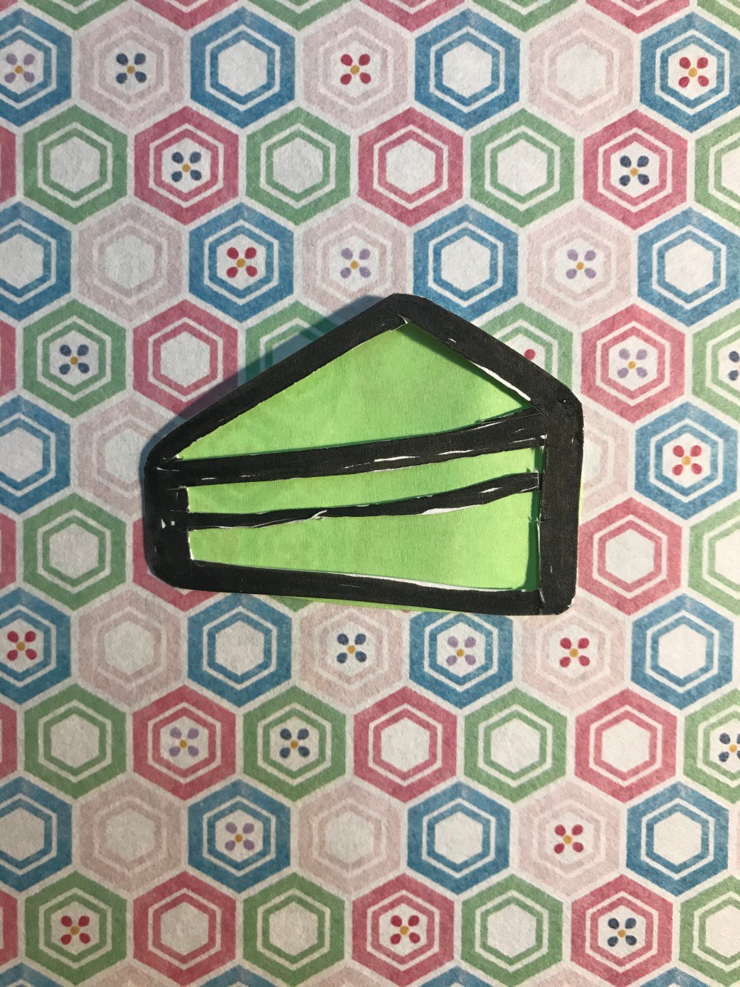
For instance, the ‘cake’ image, I would choose this pattern and simply change the colours of the centre subject.
Research on artists who work with repetition
Warhol, Andy biography at : https://www.biography.com/artist/andy-warhol
ASX, (2015) Prince of boredom in: ASX (17/12/2015) at: https://americansuburbx.com/2015/12/prince-of-boredom-the-repetitions-and-passivities-of-andy-warhol.html
Andy Warhol was an American artist, film director and producer who started his career as a successful magazine illustrator from the 60′ that is known by the iconic Campbell’s soup advertisement which was an allegory for consumerism ( mass production, big business and etc). After that he start doing the same type of images with other mass production products such as coca-cola and then celebrities. His method was to silkscreen images and produce it over and over again showing that even in repetition an image is never exactly the same, and there is no such thing as perfection .Andy Warhol strongly believe that artists should be able to change their styles and I think his repetition was also a way to say that. In many ways his repeated image show the fluidity of life in terms of same things happen daily in our lives but it is never exactly the same way. Repetition is not precise at all. We have routine demands such as eat, sex and sleep but it doesn’t mean it will be precisely the same although it is repeated over and over again.
Audrey V, Silka P and Angie Nordic, (2016) ‘Repetition in art’ in: Widewalls 24.08.16 at: https://www.widewalls.ch/repetition-in-art-artists-photography/


TATE (2012) exhibition of Yayoi Kusama at: https://www.tate.org.uk/whats-on/tate-modern/exhibition/yayoi-kusama
Yayoi Kusama is a Japanese contemporary artist who spent over 60 decades dedicated to her work. Her trademark the motif polka dots which she has used in drawings, paintings, installations, sculputures and video art. She made to New York when she was in her 20′, when New York artworld was dominated by male in 1950′. Kusama always knew what she wanted to do in art and how she wanted to achieve it. Although she has always suffered from mental illness, her obssession with dots as a motif and painting constantly without much rest; resulted in a productive habit. Her repetition using the same motif over and over shows no barrier between, where they could be placed,no matter the subject environment in space or size. She just kept doing it and still does even now in her 90s’. She channeled her trauma in a creative way. In her installation “aggregation” where furniture and a boat is covered by penises, was her own way that repetition took place to release trauma, the uncomfortable feelings related to sex and the male genital. In my opinion, Yayoi uses repetition as an intrinsic way of let go everything unwanted inside her.


Allan McCollum (2016)[user generated content online] Creat.National gallery of Art, 30/06/2106 at:
Allan McCollum is a contemporary American artist. He tried to show through “Plaster surrogates” , in a single object what we tend to collect. His repetition shows that all sorts of painting can be hanged in our wall but not only paintings. Items and others objects. The frames are also an illusion of frames as they are molds he casted in plaster and kept making more and more of it in differents sizes and colours for over a period of 10 years. The paragraph bellow is taken from my Assignment two in module two for Understanding Visual culture module.
The concept of ‘Plaster Surrogates’ is not about a piece of art but a representation of all sorts of ‘collectables’ people tend to purchase for their homes. McCollum did not intend to represent commercial, vulgar things but in keep creating a fair amount, it created a relationship with the rise of Capitalism during Modernism. This phenomenon resulted in a compulsive consumption in big quantities. I also personally believe in another meaning of the ‘Plaster Surrogates”. The ones framed as ‘black painting’, seems as an allegory of how consumerism became an act of gather in quantity rather than being selective for quality. We are pursuing for the impulsiveness of it without realising it might be already there.
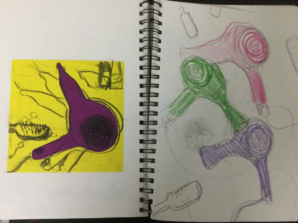
Repetition for Parallel Project
At the moment I am working on Part 5, project 4 in a piece that is taking me a fair amount of time. I can’t explain yet why and how the idea came up but it is entitled “a 100 cups of tea blends”. I am working on that everyday but for a break I keep going back to my PP and honing ideas and techniques I think would work well . Because of Project 4 on Part 5, I start to become very interested and fascinated with the idea of repetition. It is the first time I am doing a project in this method and it is giving me a feeling of joy and satisfaction despite the fact that it takes a lot time and focus, and I have been working on that over a week now. The idea of repetition gives me that sense of continuity, routine, discipline and fluidity. I have been researching about artists who worked and work with repetition and Andy Warhol is the most popular in this method. I also like the work of Yayoi Kusama, Magritte, Allan McCollum and I have found new artists who have been for different reasons, interested in “repetition”. I think I would like to link my PP to Andy Warhol, but for now, I am just having a try of what is to work with multiple, identical but in a way, different images. I am torn between the work of Scott William and Andy Warhol now. They are very different and I will have to decide soon.


I know the work of Andy Warhol was executed in silkscreen prints, something almost impossible for me to achieve in my living space. The idea is being inspired in his repetition methods. I cut out a template of an outline of a kettle. At first I tried to print it, but the paint sticks and dry very quickly on the stencil made of cardboard . The print becomes very irregular and fades away not achieving the result I wanted. I tried to paint over the lines printed but it also won’t give the printing repetition feel that I want. The identical and inadentical image repeated over and over again. 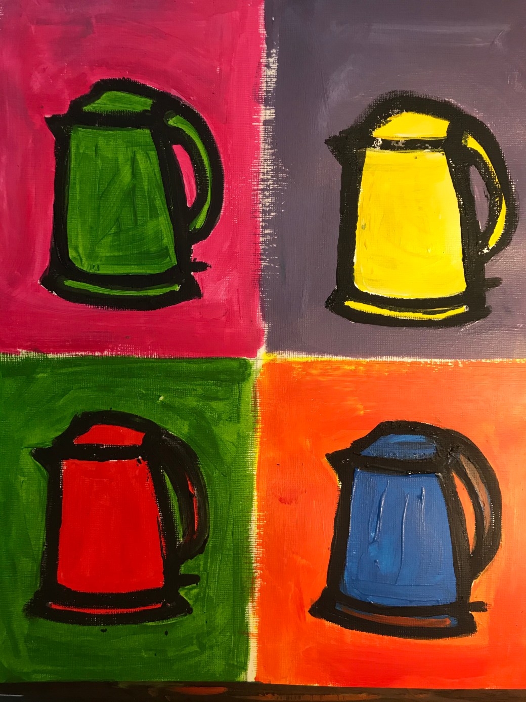
The acrylic paint almost gave the brightness in colour that I want but it is not what I had in mind yet. I would like to carve the outline of the kettle on a rubber plate, so I can print the image more clearly but I am on quarantine and all the shops are closed due to COVID-19. I am trying to explore what I can for now.
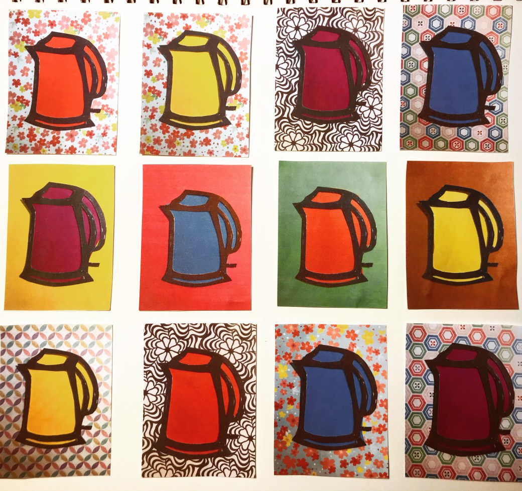
My next step was to use the stencil with two layear of papers underneath it. One for background and another for the kettle colour so I will repeat the same image over and over again without any touch ups by hand.
I like the result. My printer is not the best and I am photographing it with my phone but will discuss with my tutor Diana Ali , whatelse I can do to improve this project if I decide on linking it to Andy Warhol .


honing the ideas….
Following my tutor suggestion, I am honing my ideas about the PP. By now I am about to decide if I go for house hold items or appliances in simple, clear spaces and bright colours or I depict a more busy, detailed scene. I like both ideas. The work of William Scott has caught my eye for his use of space in pastel colours in simple combinations and the simplicity in items and scene description. At the same time I like the work of Michael Craig Martin for its bright colours but it might be too formal for me. John Bokor who I have researched for this project is also very inspiring as he really reminds me what is home, mess and how busy this environment can be. His work is very family oriented and warm. I am also think about how to present it. So far, in an artist book format is something I am considering…. Not there yet …but working towards it…


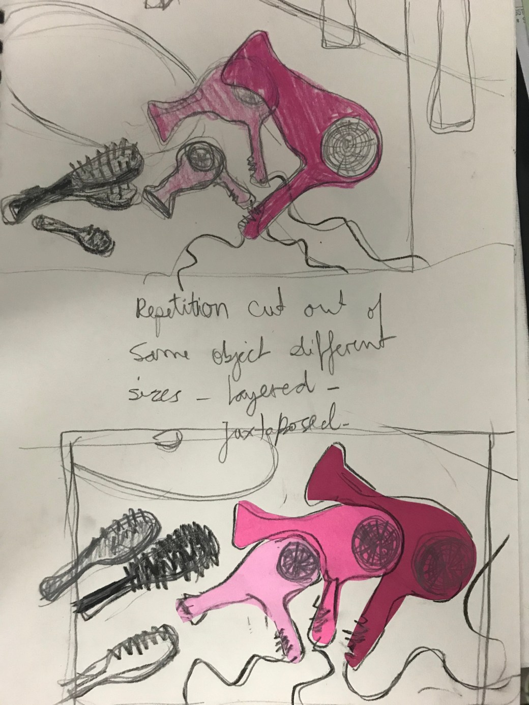
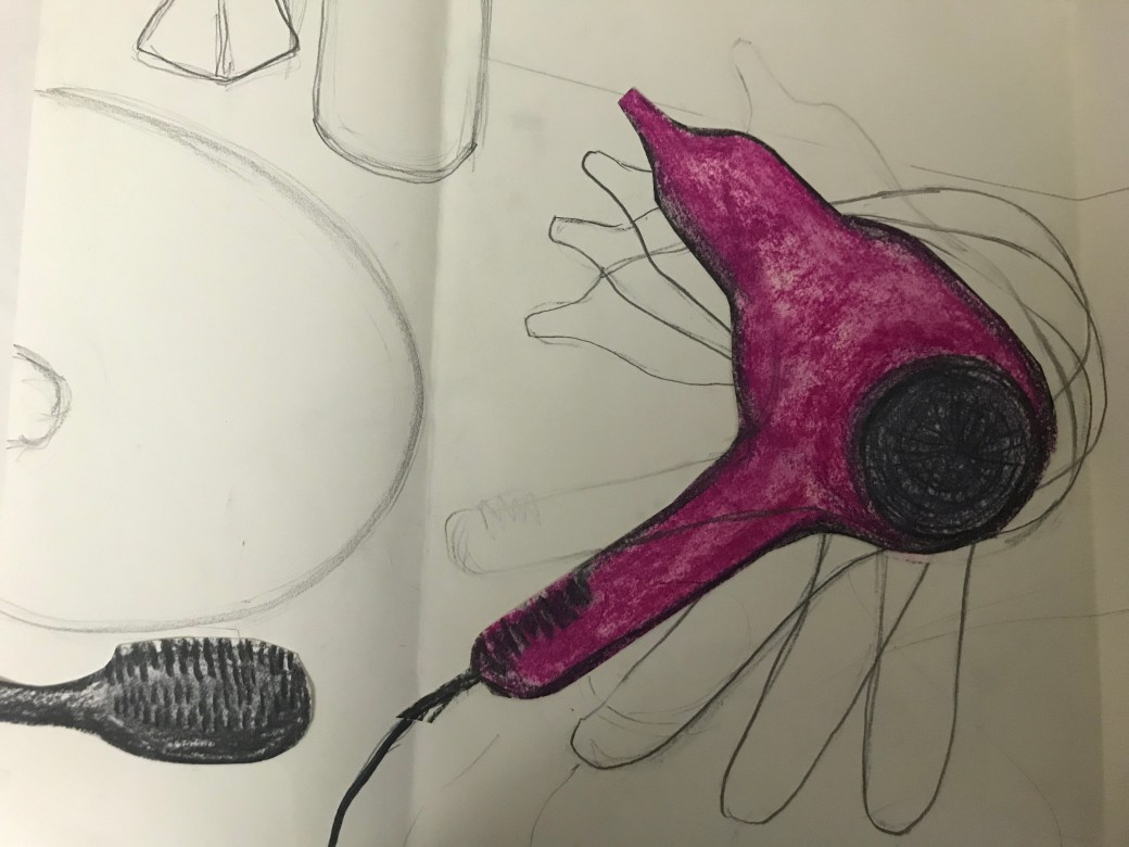
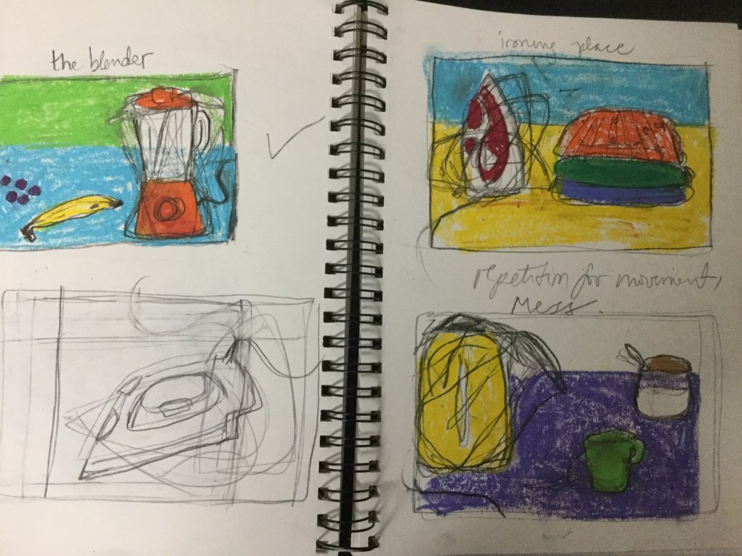
Still the hairdryer test
I am sketching, planning and I am still not sure what my tutor Diana Ali meant by ‘repetition’. I like the idea but is it really what I literally think is? I am sketching the same image over and over and when I decide what I like and then I will proceed to other images I have chosen for this project. I want to focus on main appliances I use in my domestic life daily : hairdryer, iron, vacuum, a mixer, kettle, laptop or a phone. I want my images to tell a little story about my home, a scene, a couple objects around, bold bright colours the movement of a chaotic and yet lovely home life. I like the lines that follow the object as if it is in movement. The repetition in tonal range might work as well but I need to ask my tutor opinion first.
Simple subject, bold colours, repetition and mark making
Now that I feel I am getting somewhere with my PP, I am sketching subjects about my domestic life in a simple way, using bold colours, trying a repetition technique and I want to explore some mark making.
I don’t know yet how to balance these aspects. I am almost sure about the subject, I know the colours I want but repetition and mark making is still unsure.
I like lines, messy, overlapping, scribbled. Would it suit the composition? I like the colours flat and bright. I want the subject to be simple and clear but If I want to depict chaos, shouldn’t I draw very busy scenes???
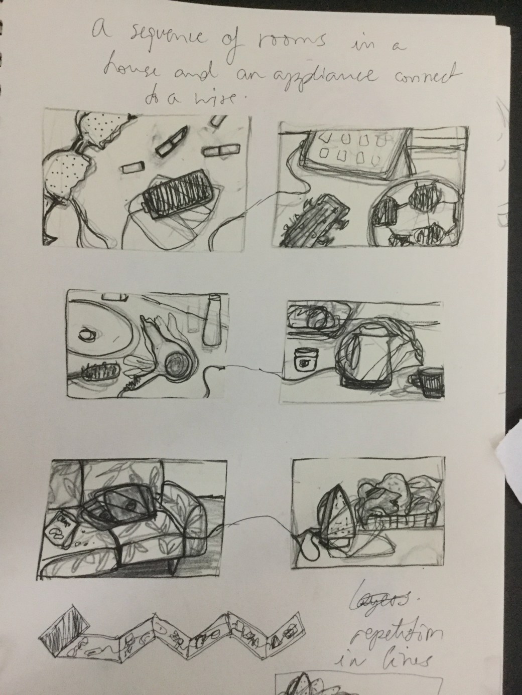
Deciding on how to present the parallel project
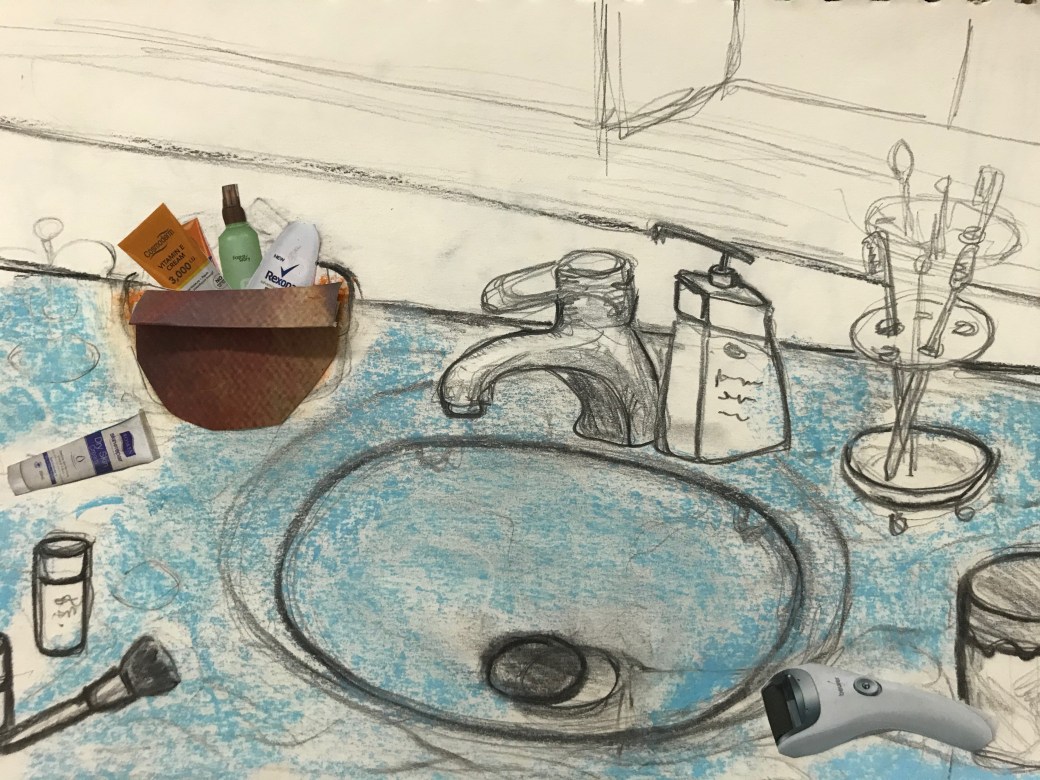
In the video session with my tutor Diana Ali, we discussed what could be the next steps to start developing my ideas further for the Parallel Project and start finding my voice in my art. I still don’t feel very confident. I am not sure I know what is my voice and if I am ready to define it through this project. I have so many ideas, I like so many ways of working, painting and drawings but right now I am experimenting, investigating and exploring so much I feel overwhelmed. I enjoyed my drawing with sewing materials, Diana thinks it is a bit tamed and she is right. I enjoyed the process but there is something not spontaneous about it and I want my art lose, spontaneous and with a dramatic but natural flow. I know when I draw something and it is ‘me’ in there. There are many things we discussed and she suggested a few things and gave me tips. I took notes but I am still a bit confused in how to present the project. The key idea for this project is : the different rooms of a home and I want to represent it between the pleasure of seen that room functioning with all the chaos that can happen. Diana said it is important to keep in mind the criteria of: technique, creativity and inventiveness . Through what she has seen now it is true that I like flat, bold colours, expressive lines and details. I need to select now some of drawing and practise how I could present it in the project. I need to keep it simple, be careful with my colours scheme, chose a technique and try to add more sophistication to it. I am working on a bathroom and living roon image. I have a couple images and Diana suggested if I could apply layers to it or repetition. I will try! 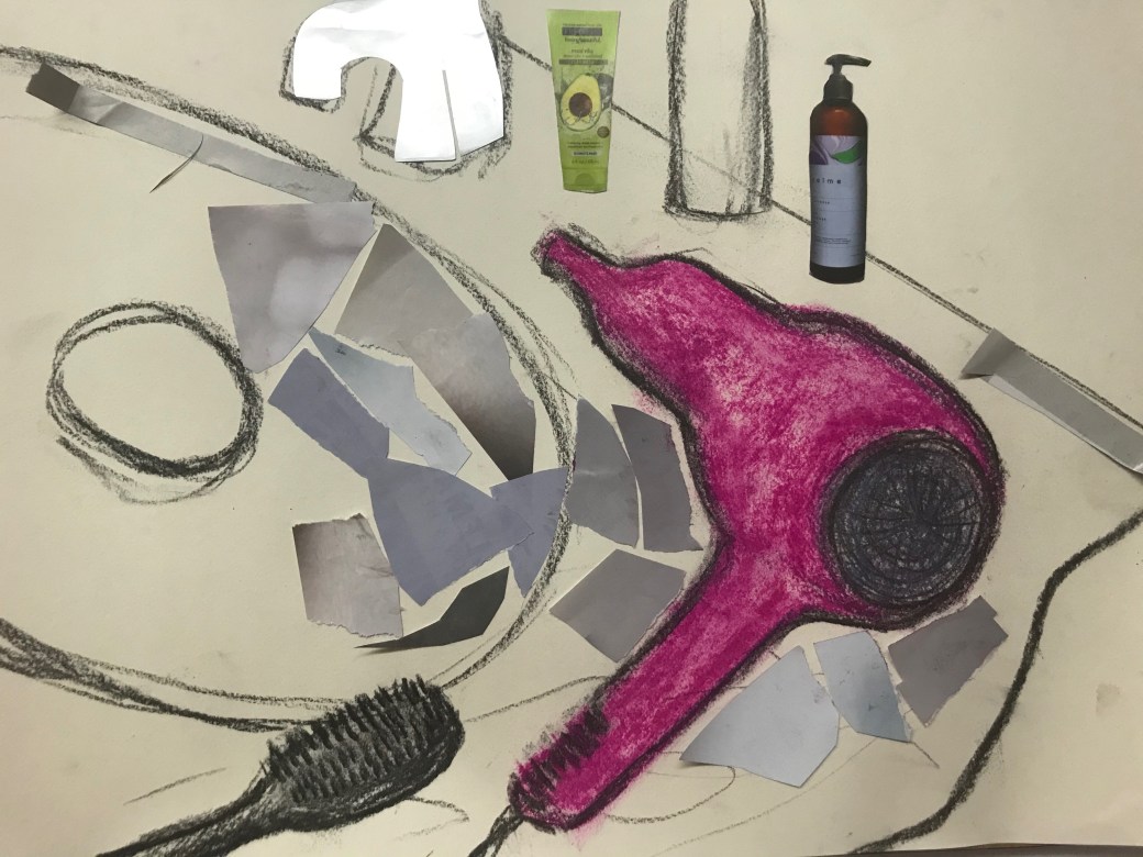
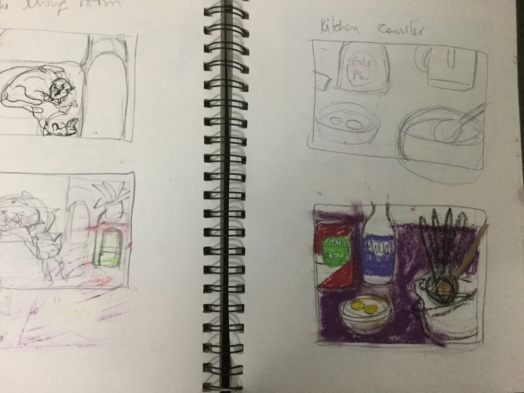
More scenes and ideas
I am sketching almost everyday, If I don’t do it daily and compensate by doing more when I am inspired. My eyes get tired easily these days and I need a break one day or another even if I don’t feel like it. Ideas pops out in my head and I try to keep it there until I can sketch them. Sometimes I just take quick notes of what I am thinking.
I am trying to reach images that I am happy with. I like colours, bright and exaggerated but sometimes I like it simple and plain in a limited pallete. I like doing neat work, meticulous but at times I just enjoy when my mark making can be seeing all over the paper. I haven’t decided yet how to present this project and I will discuss with my tutor in the next video session.
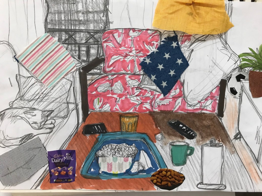
These images are from my Parallel project sketch book, includying the cover I am working on. I think the chaotic scenes in a everyday domestic life is becoming more attractive to me. I like my home spotless, neat and clean but in order to reach that, I need mess and chaos to see the difference between them. I think that is where is satisfaction comes from. When the work is done…. then the kids arrive home, and everything will be back to step 1again : mess and chaos!!!! That is my domestic life and although it is exhausting, it is also beautiful. It shows there is life in my home.


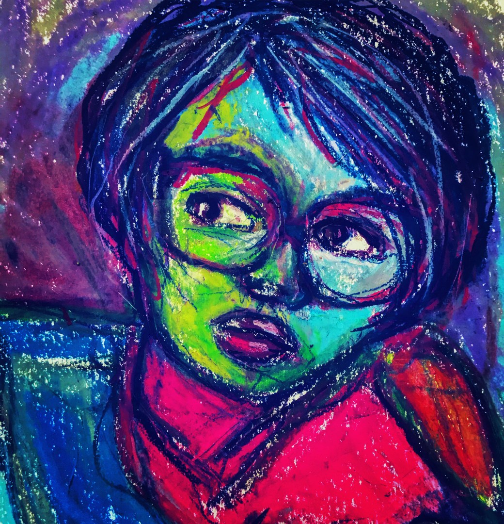
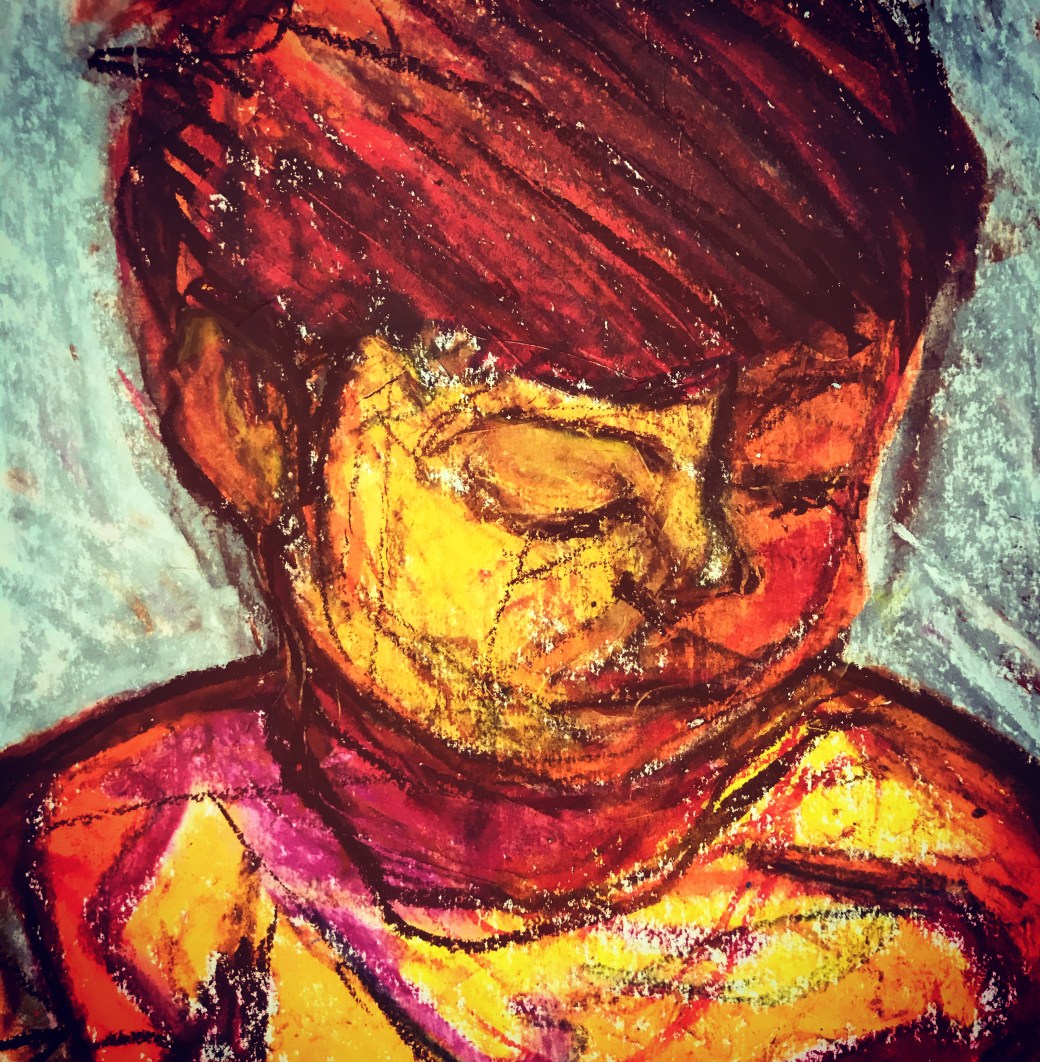
Expressive Abstract
I have started Part 3 while I am waiting to have a video session with my tutor. I really enjoyed Project 1 and after drawing an object by touching with my eyes closed, I decided to extend the experience by drawings some self portraits and my son’s portrait by observing the features for a few minutes, closing my eyes and trying on the paper. I tried with pencil and then graffiti. The result was very interesting, and since I am reading about De Kooning for Research point , I took these drawings further by giving some details to it ( with eyes open!) and add some colour, expressively and spontaneously.
I am considering trying this technique for my domestic life Parallel project just to see how it would work. I really feel in my element when I am very expressive and go with the flow without much planning.


I also drew a quick sketch of my son’s bedroom and something similar came out but I am planning to add collage with paper and textiles and see how it goes….
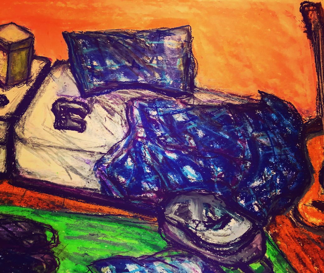
Oil crayon on paper, using scratching and scrapping techniques to achieve certain lines.
