Research suggested on Report 5:
Ellen Gallangher ‘Deluxe’ at TATE at: , https://www.tate.org.uk/art/artists/ellen-gallagher-9553
Ellen Gallangher is an African-Amercan artist who works with painting, drawing, film and video. Her ethnic background reflects a fair amount in her work. There is issues of race and racial stereotypes imposed by our society. I see Gallangher work a product of a lot research and investigation. She brings back images from the past and how it influenced the present as well her own personal view of subjects. Her experimentation and exploration with material results in unexpected results and I believe this is one of the aspects in her intentions. Gallangher brings her space and abstraction in working with elements, using cut outs, pasting, layering, printing, carving as well as video and sculputures. These are all aspects used to create a narrative. In her “Deluxe” work for example, she used cut outs of magazines from 1930′ through 1970′, glitter, gold leaf and coconut oil which is associate with african hair. This materials combined with collage and digital technology, show the meaning and importance of the african culture in America. Deluxe adresses questions of beauty, gender, changes, personal expression and cultural identity in sixty individually printed frames.

Deluxe by Ellen Gallagher 2004/05

Deluxe by Ellen Gallagher ,2004/05
In her work, Bird in hand 2006, is a poetic narrative with detailed and density to the story she tells. Ellen Gallangher rescues the past and retell stories through her perspective, exploring techniques in methods in art to deliver and engage interest in the viewers.
Jackie Kay ( 2007) ‘Souls of the sea” of Ellen Gallangher on Guardian at : https://www.theguardian.com/books/2007/apr/28/art

It is hard to view her paintings online. Gallangher’s work is composed by layers and different materials which might have a completely different impact seeing live. Online I enjoy the piece put together. I can see newspaper, cut out magazine photos, drawn lines and monochromatic combinations that fits the subject of African American culture.
Bridget Riley at : https://www.artsy.net/artist/bridget-riley
Bridget Riley at TATE at : https://www.tate.org.uk/art/artists/bridget-riley-1845
Bridget Riley is an English painter, know by her singular OP black and white paintings. Although Riley start with the pointillism technique, her later work was developed by drawings and painting that creates optical illusion. They are very meticulous work but for some reason, many of them seemed to have an hypnoctic effect, overwhelming and tiring for the eyes, specially the black and white ones. The coloured ones, presenting good combination caused me the sense of dizziness.
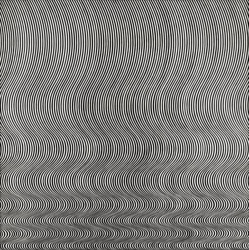
Fall by Bridget Riley – 1963
Assignment 6 – Home Pop Art


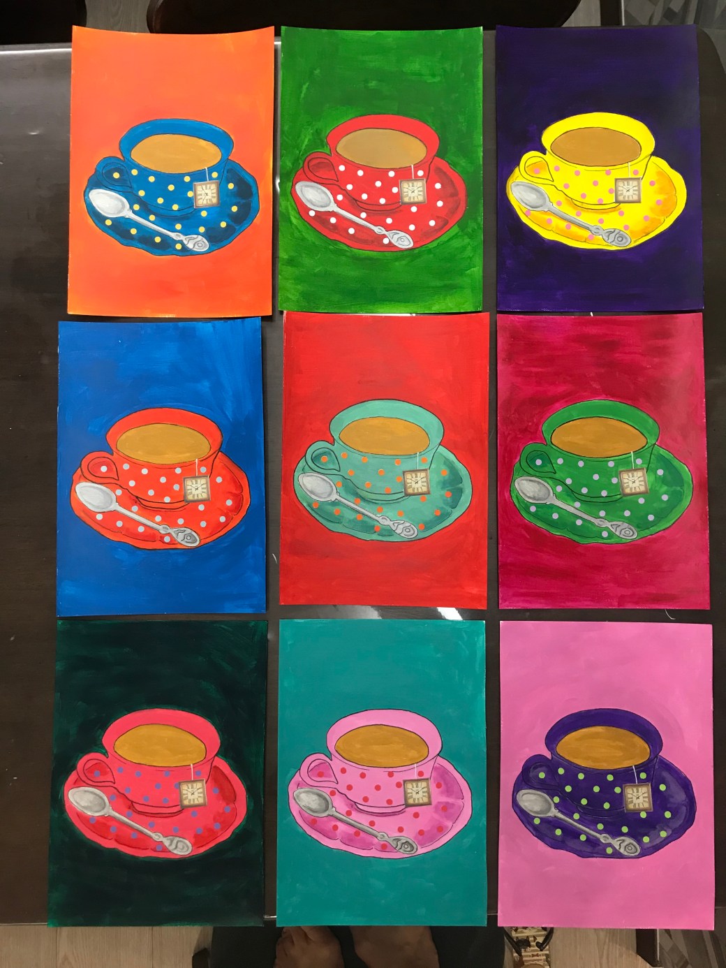
Reflection on Assignment 6:
This Last assignment is a series inspired by Andy Warhol entitled : ‘ 9 cups of tea’. I have a first attempt to execute my idea on my PP tab but in the end, it didn’t resonate what I want to express. This is what I wanted. Bright bold colours, simple and feminine. That’s why I have chosen the tea cup object. It symbolises in paganism the Goddness womb. It is an object that reminds me my grandmother, mother and me as a mum. It was decorated in polka dots in homage to Yayoi Kusama, an artist I admire so much. I like when my art is very expressive but I also enjoy doing meticulous and carefully executed work. It brings me a good sense of effort and satisfaction . My first trial is also playful and colourful but I think my choice of using patterned background made it too busy. My stensils in thick black lines lacks the drawing element I wanted. I like them for being more diversified and fun but this last choice has more of context. In my critical review I have listed the artists who inspired me but this time my focus was Andy Warhol. Since we are on lockdown, the only way I managed to repeatedly copy the same tea cup was using a template of the image in baking paper. I copied it by re tracing the mark it leaves on the acrylic paint sheets. Each sheet is a A4 size, painted with acrylics and the tea bag detailed is a clock collage. It would have a better result and sofistication if painted on canvases and if I was able to go out, I might would try and finding out if the images could be printed on the canvas before painting, so it would be more uniform in terms of positioning and lines.


Feedback on Report for Assignment 6
I am very pleased with this report. I have had a lot support from Diana Ali and she has helped me finding a direction to what resonates with me in my art. I followed all her advise and I have been reviewing some new and late work to make amendments or to keep using some elements that works well for me. There is always room for improvement and this module has been very insightful in terms of points about my art I have to consider such as in keep reasearching and linking my work to artists that inspire me , think more about context and increase the amount of sketches in order to come out with better work.
Selection for Formal Assessment :
