Find a place of significance to you to create a site-specific artwork. Responding to features of the site, add a drawn element or select a found drawn element which you will extend to express something you find interesting about the site. Relate your art work to your research in your log and synthesise what you’ve learned about installation and environment art with your own interests.
Trials:


Final pieces:


Reflection on Assignment four:
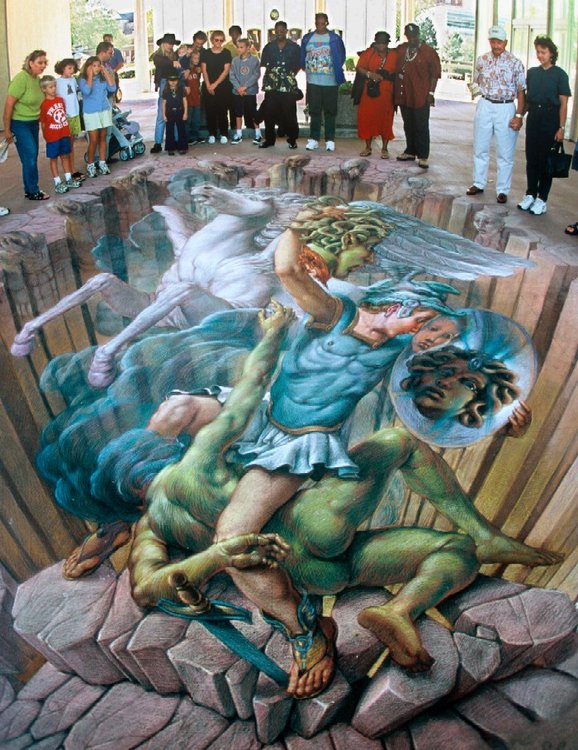
This Part was a very new experience. I find it very uncomfortable to work outdoors or look for sites I find interesting due to the weather in Southeast Asia. Project 3 (Installation) was more interesting and prepared me for this Assignment which, in the end, I really enjoyed. I was a bit apprehensive when I started going outdoors looking for sites and thinking what I wanted to find. I wanted to use my own drawings, I had a few that I really like, to interact with a real site . Using photograph and photographing places for a piece of artwork was something I have never done before. I went around my neighbourhood area and took photos of a few interesting places to work with. There are a lot of concrete surrounding the area where I live, and I wanted to add something fun or very colourful to make a contrast between the real grey world and an imaginary happy world. My favourite site was the alcove featured in one of the pillars under a flyover . As soon as I looked at it, I saw that something could be seeing on the other side of it. A secret passage or an imaginary door that would lead somewhere completely opposite of the concrete jungle around me. It is a typical urban site that pass me the feeling of being a dodgy place when it gets dark, somewhere that not many people would just hang around. I know it would be a lot easier if I had or knew how to use a drawing software, or it might be the same as it took me patience and time to cut figures, re scale images to fit the photograph, play around, photograph the images I like again and again, looking for the right time of the day and light. This experience made me think that photography is a quite fascinating practice. I enjoyed creating an image interacting an urban site with my drawings. I was inspired by the work of street artist Kurt Wenner and Edgar Mueller . I wanted to create fantasy and fun for the viewers to experience. Something to break the dulness of the concrete and make the site bright and attractive to look at. My favourite combination was adding my ‘creatures’ that I drew a long time ago for a children’s book story. They are special to me, I like how they make me giggle. They look cute and naughty at the same time as if they are always up for something. I decided to put them in other sites of photographs I took for this assignment. It is like I am telling a story. The street drain really worked well with some of them hiding behind the bushes. The least successful part I think was the one of the street lamp that I tried to make look like a spaceship. Something didn’t quite fit like the other two images. Hand cutting just lacks that polished finishing that can be done digitally. Overall I enjoyed the process and I like the result. If I had to do anything differently I would like to learn and try to do it using any drawing software, to give it more accuracy and professional look. For instance, the shadows and layers should blend together in better ways. I think through this Assignment I gained a bit of knowledge in photography, how to see things with a different perception and how art can extend to places we live in a more ‘alive’ sort of ways. I would like to explore it more in my next pieces: the mix between photographed images and my own drawings.
Kurt Wenner by Kaushik Patwary (2013) amusingplanet.com at:https://www.amusingplanet.com/2013/01/kurt-wenner-artist-who-invented-3d.html(accessed on February 2020)
Kurt Wenner is known by the artist who invented the 3D Street Art painting. He started his career as a scientific illustrator for NASA but left in 1981, sold all his belongings and moved to Italy to study figurative drawing and art from the great artists from the Renaissance. In 1991 he was commissioned to create a work of art to honor the visit of Pope John Paul II to the city of Mantua.
In the 2000’s he first introduced 3D pavement art at the Santa Barbara Museum of Art. Shortly after he founded the first street painting festival in the United States. Wenner has inspired hundreds of artists around the globe to create their own versions of street art.
He studied Anamorphism that existed in the 17th century but he created his own geometry method that he affirms is very unique from other artists.
Researches suggested on report 3: Yinka Shonibare
Yinka Shonibare MBE- ‘I’m the rebel within’ (2016) [user-generated content online] creat. TATE on 14 January 2016 at : https://youtu.be/WroXoWaGfL8 (accessed on February 2020)
https://en.wikipedia.org/wiki/Yinka_Shonibare


Yinka Shonibare is a Nigerian- British artist who works with painting, sculptures , photography , installation and recently has been working with film and performance. Born in 1962 his working medium key is the African motifs printed fabric in bright colours .Shonibare thinks artists at some point will ask themselves questions such as : What do I want to make? Where do I want to get? He describes his art as post-colonial hybrid.
Shonibare has always been a very versatile artist who changes all the time, always wanting to create something new. He produces conceptual art exploring politics, culture, history, philosophy and identity and the interrelationship between Africa and Europe. According to him these explorations broaden people’s awareness.
He states that in art school, you learn all sorts of techniques, methods and mediums . All these information can be very confusing and that is the reason he has adopt fusion in his style in art. Shonibare approaches art in a more poetic rather when didactic ways.
He founded a project in his studio in East London called “ Guest project”, which serves as a space for artists to experiment and fail. It involves around 150 artists. A platform for artistic to create their art becoming pro-active and taking ownership of where they want to take their art planning exhibitions, marketing and enterprising within themselves.
I find his art very ethic due to the use of colourful African patterns. It is beautiful and dark ,with headless figures or globes replacing heads and a certain stillness in his installation but he also creates performance where movements describes his ideas. He definetely doesn’t limit himself to form and shape. Shonibare art is also very sophisticated using the colourful fabrics in colonial European outfits as a contrast of races, racism and history. Yinka Shonibare is not only an artist who creates and executes art in various ways but also a collaborator in the art community with a project that makes art an endless cycle in life.
Michael Readecker by Karen Wright (2106) on Independent.co.uk at: https://www.independent.co.uk/arts-entertainment/art/features/michael-raedecker-artist-youre-in-the-studio-every-day-and-you-want-to-keep-things-lively-and-a6895566.html (accessed in February 2020)
Zone by Michael Readecker (2000)
The other side by Michael Readecker (2002)
Micheal Readecher is a Dutch artist who works in London. Initially trained in fashion designer, he combines the traditional craft of needlework with the successful history of painting. Readecker work has many aspects of domesticity in working with fabrics, sticking and embroidery. He is a very experimental artist, using craft material and blending it with his interesting combinations of colours and imagery. I think Readecker reaches the right balance in his tonal range in his monochromatic paintings. The lighting, softness and smooth look blended with stitched details, forms simple and intriguing compositions with a touch of texture of fabric, thread or embroidery.
Michael Craig Martin – ‘Oak tree’ (1972) TATE in 2002 at: https://www.tate.org.uk/art/artworks/craig-martin-an-oak-tree-l02262
Michael Craig Martin , Gagosian at: https://gagosian.com/artists/michael-craig-martin/


John Michael Craig Martin is an Irish -born (in 1941) conceptual, contemporary artist and painter. Martin grew up and studied in the United States but lives and works in London since 1966. In the late 1970′ he started line drawing of ordinary objects. His central idea in his art is the relationship and tension between objects, representation and language. In 1990′ he made a decisive shift in using bold outlines, vibrant colours in flat, clear representation. Through exacting draftsmanship, he uses composition to explore spatial relationships by juxtaposing and layering color. Martin is interested in ordinary objects and the purpose of them. He intended to abstain from style using tape to draw objects without having his own drawing style, doing it by hand and yet, it became his style. He brings out in every ordinary object the beauty and the function of it in using vibrant colours . These colours make them stand out almost as they are alive characters, but not in a cartoony way because it is elegantly traced with its real features .They as represented exactly as they are. Michael Craig Martin gives us a different perception of everyday ordinary objects most people possess, in a energetic and impacting way. His very intriguing work might be ‘Oak tree’. A glass of water placed on the shelf which in the proof of that impossibility, it also deals with language, meaning and what we created and give name in our minds. The preconception we have about material things. It questions our belief in things around us.
Elizabeth Peyton on Wikipedia at : https://en.wikipedia.org/wiki/Elizabeth_Peyton
Elizabeth Peyton on theartstory.org at :https://www.theartstory.org/artist/peyton-elizabeth/
Elizabeth Peyton : Faces contains their time (2015) [user-generated content online] Creat. Lousiana Channel on 09 November 2015 at: https://youtu.be/3Hwl1l_j2vE (accessed on 16th Feb 2020)

John Lennon (1965) by Elizabeth Peyton in 1990′

Elizabeth Peyton is an American artist born in 1965 . She is known by her small scale portraits of friends, celebrities and historical figures. Her painting has a transparency and her strokes varies from watery to deep, visible shapes and shades.She works from photography, printing or live models.
“Peyton’s portraits, distinct in their female gaze, explore contemporary concepts of identity, sexuality, and beauty using similar techniques and styles that have become de rigueur in modern fashion illustration. Men and women become elongated and androgynous, blushed with feminine hues, evolving and reviving the Romanticism of 18th and 19th century British portraiture. ” (theartstory.org)
The Paragraph above describe in specific words my first impressions of Peyton’s portraits. An androgynous and very feminine feel is one of the uniqueness in her style.
I think the differential in Peyton’s portraits is not the fact that she only portrays the subject but she puts how she feels about the subject and the time it is happening. It is not static faces,but it feels as a scene from a movie or situation we see when observing people. They are emotional and gives a sense of place and energy in the ways she uses her brush strokes, colours, lighting, angles and background. The time represented in her paintings shows our fascination for beauty in the old days to modern, social media oriented life style. The intriguing behaviour of creating intimacy with people we only know from afar.
Feedback on Report for Assignment 4
I was so glad to hear that my Assignment 4 was successful! This part had it’s big ups and downs. Working with outdoors environment was really hard and I don’t think I did or do well. I tried my best and I still tend to take the projects explained on the module to literally. It is a difficult situation and part of long distance learning. I rely mostly on my own understanding of what I read. I am also glad that my researches went well. Diana gave me a good reminder of relating my work to the artists I have been learning about. I must keep it in mind in the next coming projects. Overall, I am really taking into consideration comments such as : take ownership of the projects, turn it around to resonate to me more. I need to lose the fear of doing something wrong! When I put all my heart in my artwork, when I draw what really gives me joy, the result tends to be a successful one. Assignment 4 proved it. Next part I will do more work per project, dig into what really inspires me, relate my work to the artists I have been searching and start defining what I want and how to present my PP.
