Project 4 -Time and the viewer

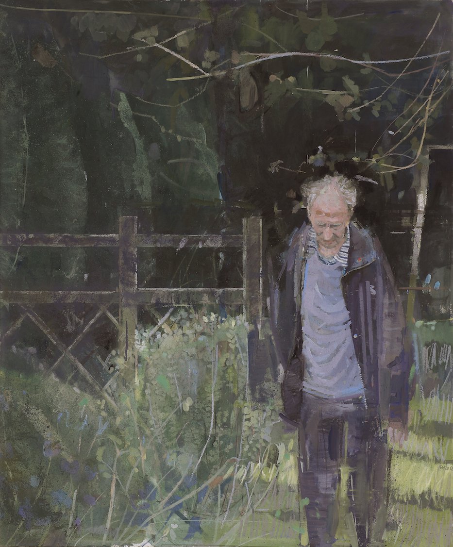
Contextual focus point: Frank Auerbach’s portraiture

http://www.visual-arts-cork.com/famous-artists/frank-auerbach.htm

https://www.theartstory.org/artist/auerbach-frank/artworks/#pnt_5

halflegthnude

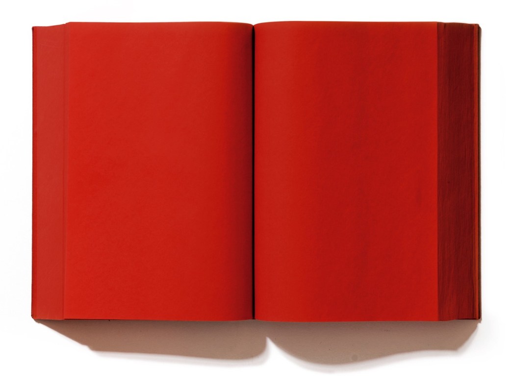
E.O.W ( Estella Olive West) half nude portrait by Frank Auerbach

Head of E.O.W. 1959-60 by Frank Auerbach born 1931

E.O.W ( Estella Olive West) portrait by Frank Auerbach

Frank Auerbach is a German/British artist born in 1931. Auerbach was  brought to England when he was 7 years old  during WWII. His parents stayed back and died in a Jewish concentration camp . Auerbach is known by his thick impasto brushstrokes technique in landscapes and his portraits. His style is considered to be Neo-impressionist. He has developed a deep and strong relationship with his art, in a way, how it happens with people.  This is one of the reasons that he takes time in each work he completes. He gets to know his subject. He works with regular sitters who have posed for him for decades, one of them, Ms. Auerbach, his wife. His paintings consists in many layers of thick paint, becoming almost a piece between painting and sculpture. Like many post WWII artists, Auerbach has made a sharp distinction between figurative and abstract. He captures the essence of people in his portraits with  concepts such as mutability and impermance. Auerbach records the chaos within the psychological state either in him, the sitter, or both. He tends to paint, scrape and paint over, again and again similarly, in  the way we are and how we are constantly subjected to changes, biologically, mentally and emotionally. His portraits has traces of feelings that affected everyone during WWII, a feature in many post war artists.  It is heavy, dense and affectionate. The difference in his work between photographs and life paintings is the ability he has to  capture the subject, his perception and reading of the environment or the person who poses for him. It would not be possible to have the same energy and view if it was a photograph, a 2D still image. He has his sitter and him there ,  in different sessions, feeling differently, in a different time, over long periods of time . These factors are essential to the production and result of his work.

” If you pass something everyday and it has a little character, it begins to intrigue you” Frank Auerbach

Researches suggested on report Assignment 4

The Boyle family – piano nobile at : https://www.piano-nobile.com/artists/1171-boyle-family/biography/

https://www.artsy.net/artist/boyle-family

The Boyle family (2010) [user genereated content online]Creat. TATE shots 15 sep 2010 at:

Mark Boyle was an artist born in  Glasgow, Scotland. He married Joan Hills and after they had their own children, they named the project Boyle family that describes collaborated work with family and their community. The project first called ‘Planet earth” start in 1968. They use earth material and their environment to show interaction, exploration and investigating the meaning of them. From Hills, rocks and sea. They show in a poetic way taking elemental studies to be observed, felt and understood through various mediums. It a journey to questions our environment and our function in it. How the world changes and how we change this world. I think The Boyle family forces us to look into details and places that we don’t hardly notice by isolating this pieces out of its environment. It shows beauty, roughness, weight or lightness and the feel, necessity or purpose of them within us. At the same time how nature acts upon us.


mario-merz-igloos-hangar-bicocca-designboom-fb

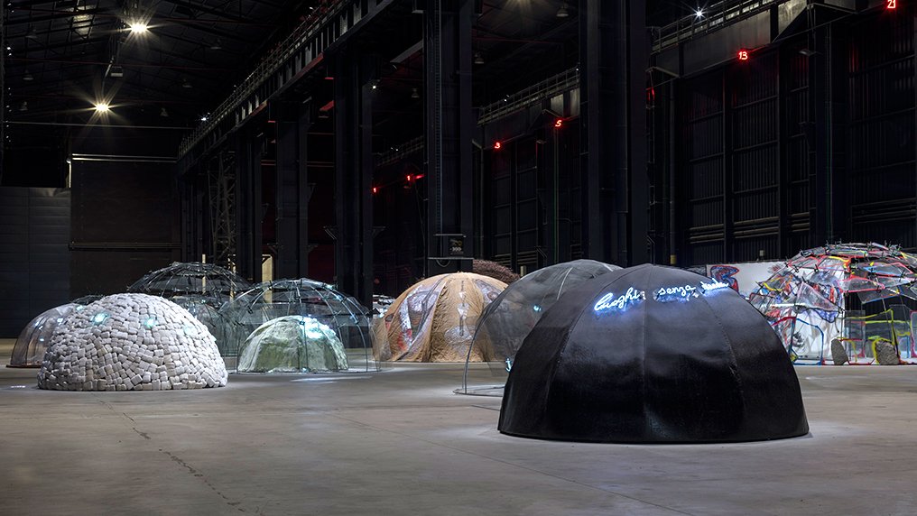
McKever, Rosalind(2018) ‘The enigmatic igloos of Mario Merz’, Apollo Magazine, 7 nov 2108 at:  https://www.apollo-magazine.com/the-enigmatic-igloos-of-mario-merz/

Mario Merz was an Italian artist associated with art paver ( literally meaning poor art). He was imprisioned in World War II when he start drawing. Merz began to develop deep interest in architecture and in 1968 he started his igloos’s project going through the 80′ and he kept doing till his death in 2003. The igloos are  made with a combination of man made structure and natural materials. From stones from Brazil to twigs, rock, glass, they vary in materials from all over the world. Very interesting the exhibition on Tate’s in 1985, entitled: Do we go around houses or do houses go around us? Food for thought. Merz main motif for his art is a mixture of political, economical and environment context. It can be seeing as perceived by the viewer. It might mean, refugees shelter for some, security and protection for others, poverty, defense, the need to protect the environment due to the natural materials he uses, protest, use of space and individuality.
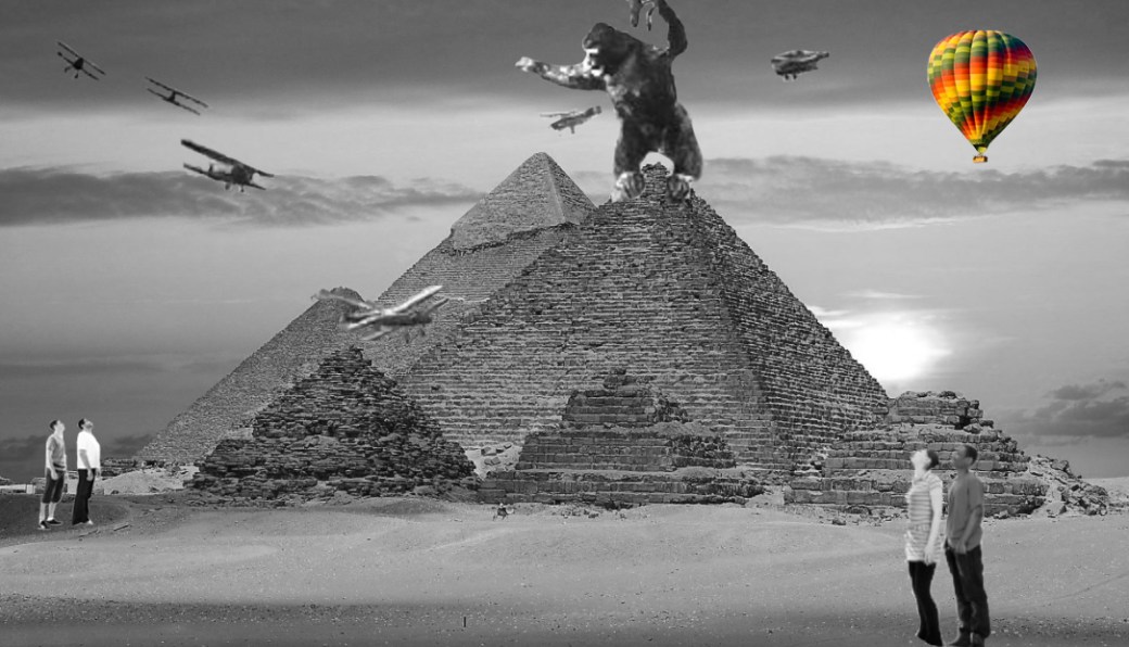
 

john-goto-styled-artwork

work by John Goto

Friedlaender, Linda . Reynold-Kaye,Jennifer and Skipton, Long (2018) John Goto’s ‘ High Summer’, Yale center for British art, 6 April 2018 at:  https://britishart.yale.edu/exhibitions/art-focus-john-gotos-high-summe

John Goto is a British born photographer who has an interesting way of blending figures in photographes of sites in the past and people of the present in a satirical and surrealist manner. His photographes are a travel on time, questioning places, our actions, how we fit or not in our society and world.

Project 4 – Time and the viewer

Aim: Make a drawing which forces the viewer to use time differently. This may mean a drawing which takes time to make sense of or a drawing that creates a feeling of certain pace. The drawing may need an investment of time by the viewer in some way. A drawing is a record of the time you spent making it, but the viewer also spends time looking at it. perhaps seeking meaning, enjoying its beauty or marvelling at the artist’s skill.

IMG_8955

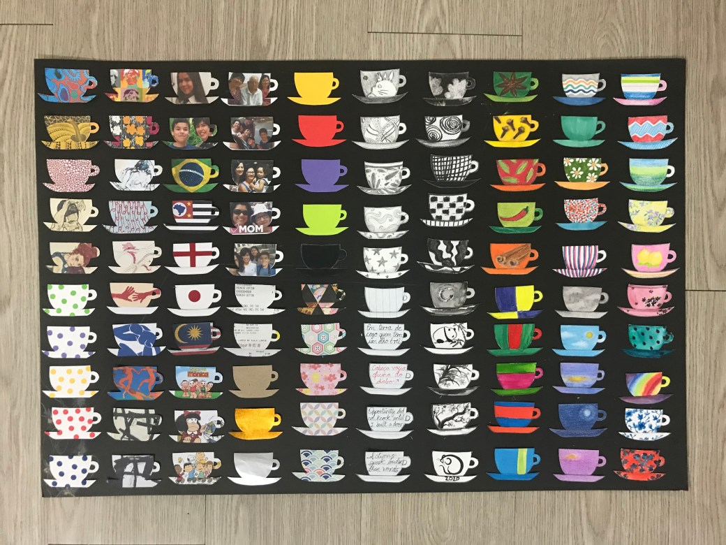
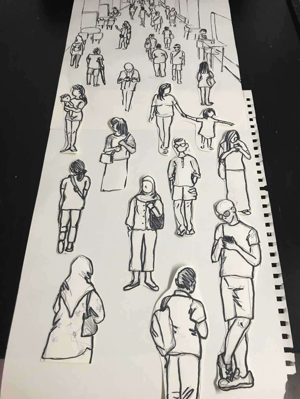
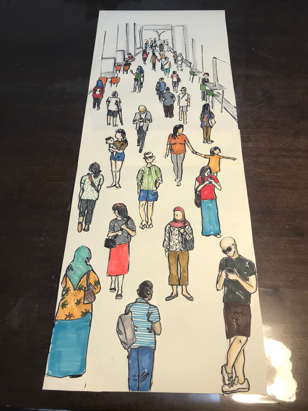
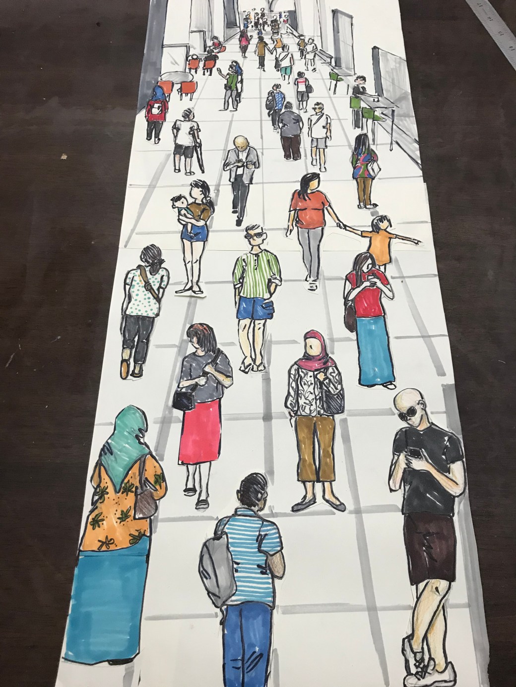
‘My hundred blends of tea cups’  by Katia Setsuko

Reflection: The viewers I had (mostly viewed this over the phone due to lockdown), but I had my children and a friend looking at it. Most comments were that it was like telling a story, a narrative about myself. Many admired the details and patience in cutting each cup individually and the variety of patterns and subjects in them. I have chosen a cup of tea as a start of a conversation. In many places around the world people start a conversation over a cup of tea, or coffee. The cup of tea simbolizes taking the time to listen, to talk, to look at things together.A cup of tea is always an invitation to relax, enjoy reflection time alone or with friends. It is comforting, joyful, meaningful.  It is a ritual done alone or in a group in  many cultures around the world. The cup itself is also relevant to some people. Some like in a mug, or a pretty cup, or a pottery special made tea cup like in Japan. The cup can be special for many reasons: a gift from someone, the imprint in it, the material made of, the brand, the size… My narrative is about myself and my path through life and art. From markers, to watercolour, chinese ink, pencil, charcoal, soft pastel, oil crayon, acrylics, origami paper, writings, photos of my loved ones, places that matter to me, where I come from, textures, artists that I admire mostly and patterns…. They might be too busy, too much to read. If I had to do it again I would have done different selections of objects such as tea pots, tea cups, mugs, cups, and each selection would approach a different narrative: subconscious expression, people, feelings, concepts of art etc. This piece of work is just who I am. Many things wonders in my mind at the same time, all the time. There are many things I like, many things I talk about when with friends.
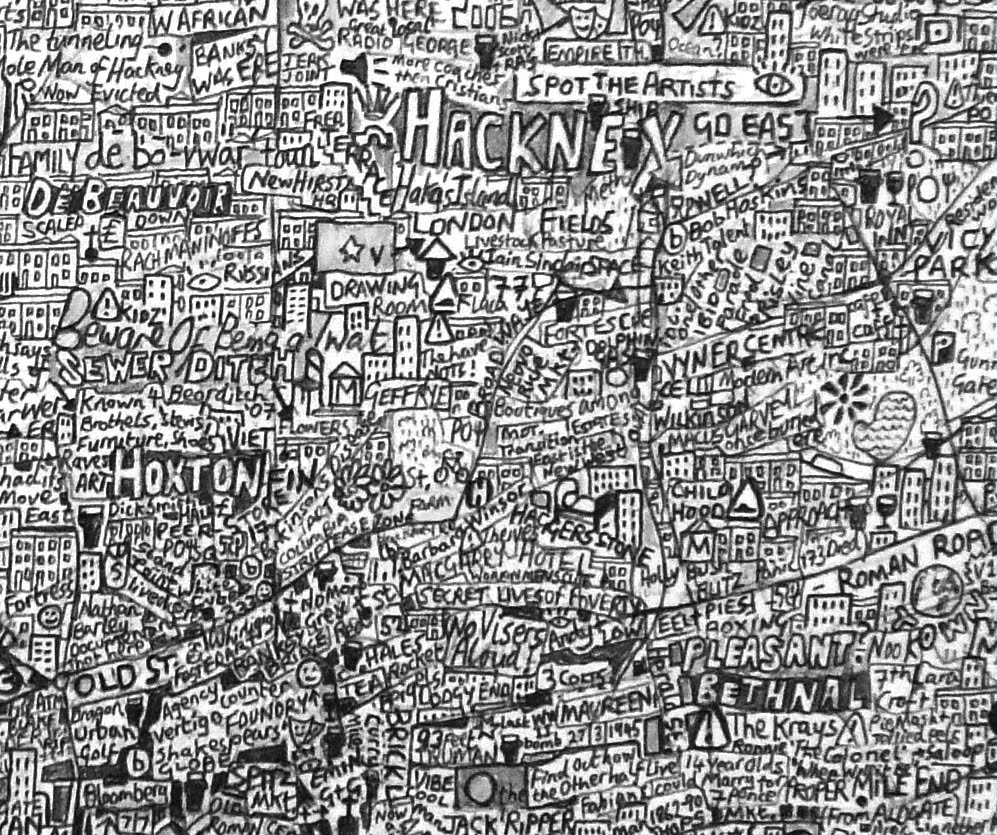
 

Advertisement

Project 3 – A finer focus

Researches:

TATE – Richard Wright https://www.tate.org.uk/whats-on/tate-britain/exhibition/turner-prize-2009/turner-prize-2009-artists-richard-wright

Richard Wright is an English artist and musician born in London. His intricate designs are in geometrical patterns painted in the the Renaissance technique of fresco and gold leaf. He is interested in painting large scales areas such as ceilings, corners or stairwells. His work has a short life spam as he believe it wouldn’t be absorbed by the art world, I guess he is referering to a comercialised way. I understand and admire his choice of making the art for “now”, it is not about the future. Richard Wright won Turner Prize in 2009. I think his work is very meaningul and romantic. It intrigues the viewers and give people his perception of art and time.

starwellproject

The stairwell project by Richard Wright

intlited richard

Untitled, wall painting  by Richard Wright

goldleafpaiting

Award winning gold leaf painting by Richard Wright


TATE – Grayson Perry  at: https://www.tate.org.uk/art/artists/grayson-perry-4657

 Grayson Perry is so  humbly opened about who he is and I think that is one of the reasons people get so engaged in his talks and with  his art. Bright colours and images, a variety of subjects and approaches, he deals with the matters of the world. His depiction is explicit , full of humour, provoking and seducing ways. On the article about his first artwork, I relate to him in the sense that sometimes in the middle of the night, ideas come to his head and he has to just doodle some of it on paper. In preparation for his work it will have some additions and changes but the foundation will be pretty much a resemblance of what he had first sketched. The same happens to me, although I think I am not confident or experienced enough to develop my initial ideas and sketches all the way to a final piece in a more aesthetic and professional way.  It is motivating and inspiring to know that an artist do not need to stick with a subject all the time. Grayson Perry deals with his childhood matters, the subconscious ,politics, what is going on in the world , and put images and pieces together creating a narrative. I like how he depicts figures in the foreground a lot bigger than the background.  I think he can play around with his feeling and moods in his art because his style is consistent and from tapestry to  vases, mixing mediums, textures and materials, he has an unique style and that is what makes him so recognised in the artworld .Grayson made use of all his experiences from emotional pain and self-discovery into strong  pieces of art, also adding  light feelings  and humorous touch. His is an audacious,  simple and committed artist. His work really feels that is made for himself at first, and the consequence is that  he is able to share them with his viewers. Many people can relate to his art.  The difference is that most of us are not brave enough to completely open up about our  deep and dark secrets; not realising we are all the same.

Aspects of Myself 2001 by Grayson Perry born 1960

Aspects of myself, 2001 by Grayson Perry

gp276_thewalthamstowtapestry_detail_2009

The Walthamstow Tapestry, 2009 by Grayson Perry


Gagosian Gallery – Paul Noble at:  https://gagosian.com/artists/paul-noble/

Paul Noble is a British artist who lives and works in London. He has received international recognition for his  monumental drawing project of Nobson Newtown. His meticulous drawings of an imaginary city, with accurate details of real urban escapes,  depicts the imaginary versus melancolic scenes of an utopic city . Noble played and acted as architect, archeologist, cartographer, urban planner, engineer, activist and more. For this project, Noble was inspired by Chinese scrolls and Japanese sculptures. The Vimeo above gives an insightful tour into his drawing, helping to understand and have a closer look in each scene, showing fragments of it and his process in his studios. His work is amazingly detailed and only with a magnifying glass I could go through smaller figures in parts of the town, in the book Vitamin D – New Perspectives in Drawing.


Adams, Tim (2015) [The Guardian, interview with Stephen Walter] at:  https://www.theguardian.com/artanddesign/2015/may/10/stephen-walter-artist-map-maker-london-interview

Stephen Walter is a British artist who lives in London and hand draw maps with pencils with extreme amount of accurate details. His work consists in dedication and time, from days, weeks or months. William Blake is one of the artists he is inspired by. His work   is an amazing melting pot of history, traditions, etymology and landscape. Walter gravitates between urban and wilderness places. He sounds like a very old soul in a young body. The reason  that now  he only draws with pencil is because  he found out he was producing toxic waste by using ink in the past. It made him changed his medium. Curiosity, enviromental awareness , passion and dedication are some of the aspects that makes him an inspiring artist. Beyond drawings, his maps is a work of research, investigation and explorationg of cities. As the title of the interview suggest, a lot of his work is about the human residues and traces left, and it takes time to settle in the geography. He traces all of them or at least he tries and creates a poetic, meticulous and engaging artwork.

waltermap

The Island by Stephen Walter – 2008


Project 3: Chose a subject with a substancial number of detailed parts. Consider also whether the parts will be drawn from observation or invented. Remember that the original subject may not be primarity visual (in extended doodling for example); you may be using drawing to describe a narrative or even musical score, so that the imagery is secondary to the relationships between the elements.

Reflection: My first attempt was the pomegranate fruit. I drew by observing the real fruit plus a few photos of it. It required quite an amount of details and I did it with watercolour. The background is oil crayon. The second one was also a still life I set. It took me longer to achieve the details of the coffee beans as they were a lot darker than the pomegranate seeds. The third drawing was a bunch of buttons mostly done by imagination. I checked one or two photos on the internet but the planning , colour and amound I just kept doing. It is a layer in markers and as I progressed, I overlayered with cut outs from coloured paper. These drawing are all in A3 paper. I enjoyed doing all of them but the buttons was the one that took more time, effort and planning. I wanted to fill up the paper but left the edges a bit undone. I like bright colours, I like that the item is linked to my interest in domesticity. I think I can relate this project a little bit with the work of Stephen Walter. My passion for what I want to draw is growing, I go around my house, I hold, look for objects, observe everything around me and what is the purpose of it.   I had a great  feeling of satisfaction when I finished the buttons one. It is that feeling of: Yes, this one is done and I am proud of it. I think it exudes to the viewers, its energy catch their eyes. I have showed to a few friends and they really enjoyed looking at it, at the details, colours and overall the time taken to execute it. The work of Stephen Walter and this project gave me good ideas for my next project in Part 4.

Project 1 – A changing scene

Aim: Drawing moving figures or a changing scene can be extremely challenging. A large part of that challenge, however, is your own conception of the purpose. By taking a step back from trying to pin the action down to a static conclusion, and instead making a drawing which is a record of the movement and action itself, we can begin to reflect on how to balance movement and form to create a dynamic image.

Method: Find a fairly busy scene, with plenty of movement. Sit somewhere comfortable and out of the way and start making a drawing. As someting catches you eye, capture it as best you can. Keep responding to movements as they happen so you build up a drawing full of dynamic energy. Depending on how fast you can capture form , you may be able to build up a convincing representation of the scene. Don’t lose focus, make each mark as accurately as you can.

IMG_9800IMG_3906

IMG_4374

Reflection:  I didn’t feel comfortable doing this project. I do not enjoy working outdoors, in busy places and it really hurt my eyes trying to draw things in movement. I tried to capture as best as I could as people passed by, their body overall shapes and movements. Most of the time I only managed half way through but after a while I became faster in just outline main features of each person that caught my eye. I like details and colours and it was very challenging just sketching quickly what I saw. Everything else in this project I worked by memory (that was the only part I enjoyed). I think pencil and graffiti were the best materials to execute this project. I used 2B and 4B pencils which gave me the flexibility in shades and quick darker and lighter lines to depict distance. I did many sketches of the people passing by, anywhere I could find space in my pages. Back home I figure I had enough to build up the whole scene by cutting and pasting people in the right sizes according to distance. I had to add some colours to give it a more energetic and happy energy to it. Since I do not enjoy working outdoors and I was not feeling very positive, I thought about making a few changes back in the comfort of my home, to present a colourful and nice work.

Project 2 – An artist’s book

Researches:

Hans Peter Feldmann on guggenheim at: https://www.guggenheim.org/artwork/artist/hans-peter-feldmann

https://en.wikipedia.org/wiki/Hans-Peter_Feldmann

Hans Peter Feldmann at Simon Lee gallery from 24 november 2016 to 24 January 2017 at: https://www.simonleegallery.com/artists/hans-peter-feldmann/


Hans Peter Feldmann, is a conceptual artist born in 1941 in Dusselforf, Germany. He began his career in the early 1960’s making a series of picture books assembling small staple- bound artist’s books that each contained images of certain types such as soccer players, unmade beds, or women’s knees.He is a collector and appropriator of found images and everyday ordinary short term use  and popular images of objects. He represents and rework on the images bringing new contexts to them. Feldmann work has an aesthetic and conceptual simplicity. It is playful and executed in meticulous ways.  His art work in exhibition remains untitled as he disagree that art should be purchased or owned but to be purely for the viewers personal experience . I think the art of Feldmann shows the variety of material we can use in art. He develops new concepts and images by working in everyday visuals that are part of our lives. Feldmann art is diversified and yet he keeps the sense of simplicity and in our present times it brings awareness for recycling, reusing the unwanted or forgoten and  bring them back to viewers with a new meaning or just with a new light . Feldmann doesn’t draw or paint but the manipulation of his collectables has the same effect in transforming shapes, forms and colours communicating visually his thoughts and feelings about the subject.


Wolfgang Tillmans, the art and life of  by Emily Witt, The New Yorker on 10th Sep 2018 at: https://www.newyorker.com/magazine/2018/09/10/the-life-and-art-of-wolfgang-tillmans

https://en.wikipedia.org/wiki/Wolfgang_Tillmans

Wolfgang Tillmanns is a German photographer born in 1968. He studied in Germany and London and was the first non-British person to be awarded the Turner Prize in 2000. Tillmans is known by his diversified body of work . His photos varies from still life, skies, astrophotography and political interests specially in homossexuality and gender identity. He produces images for installations from small to very large. In 1998 Tillmans thought the world have been over photographed and became interested in the chemical foundation of photographic material as well as its haptic spatial possibilities . This new interest gave origin to his abstract work. In my opinion Tillmans work explores the unusual perception of photography. He reinvent objects, given them new meaning or no meaning at all but a sense of deep aesthetic within the space. Tillmans work has many phases and subjects according to his view in the world and the environment he is in. His knowledge and interests goes beyond photography but in people’s emotions and behaviour. I  like the relationship he makes in some still life photos and its setting.It is not about the fruit place by the swimming pool but the colours contrast, space, details and energy in it.  The beggining of his career is definetely very political, approaching sex and gender identity. His abstracts are very investigative in material,image and effects. Wolfgang Tillmans work gives many possibilities for thinking, understanding, enjoying  and questioning  the world we live in .

Eileen Hogan by MacKenzie Belisle on 24th May 2019 at :  https://www.newhavenarts.org/arts-paper/articles/eileen-hogans-windows-on-reality

Eileen Hogan by Roderick Conway Morris on 6th June 2013 at: https://www.nytimes.com/2013/06/07/arts/british-artist-explores-poetry-of-light-in-enclosed-spaces.html

Eileen Hogan_Ian Hamilton Finlay, 2012

Ian Hamilton by Eileen Hogan, 2012

eileengardenmuseumhogan

Eileen Hogan is a British born in London 1946. She is a painter and artist book. Eileen studied at Camberwell College of art when she was 16. The methodology there at the time was very strict . There was an emphasis to draw things very closely which although was restricting it brought some discipline in advantage on how she developed her work. Eileen tends to draw the same object over and over. It involves time and changes, the same ways are we are subject to these factors in our emotions. She started drawing enclosures when she was still studying in Camberwell. Her first interest was in Toothing Common. She feels more comfortable than drawing open landscapes. Eileen developed a deep interest in gardens. She gets inspired by a wall or flower beds for its geometry and the interaction with the place. Another remarkable feature in her paintings are rain and mist. She has the ability to bring that translucent and blurry sensation in a very accurate way. It is abstract but specific. Her painting capture emotion and a very intimate interaction rather it is about people or places. Her time in Greece helped her define what she paints and why. Her attention to geometric lines and light and shade. She is interested in writing and the lines comes to her with the principle that drawing and writing start in the same way: with a line, where everything is placed. Her light and shades brings out emotions and mood, the unconscious part of her paintings.

“The whole idea of presence and absence runs through all of my work. And when I am working on a series of pictures the memory of the place is as important as the place itself,” she said. “I find painting a way of expressing subtle and elusive emotions that I wouldn’t begin to know how to describe in words.” Eileen Hogan – New York times,2013


Georgio Maffei and Maura Picciau at Corraini Edition on 17th February 2015 at:   https://medium.com/@CorrainiEd/the-artists-book-instructions-for-use-dfe855d5ec8

Very clarifying text taken from ” The book as a work of art” by Georgio Maffei and Maura Picciau. I think I finally understand what the artist’s book mean. The relationship between art and books. It is not a restrict definition but a phenomenon where art is presented in a book structure, works of art. It is  reinveted by different artists. It can be poetic, illustrated, minimalistic, informative, conceptual, formated simply with images or words and images. It  serve as a self analysis for the artists own work and a place of research.

maff

An unreadable quadrat-print by Bruno Munari,  1953

georgiomaffei

Salle de Fetes by Ettore Spolletti , 1998

 Sol Lewitt at : https://www.theartstory.org/artist/lewitt-sol/

 Sol Lewitt artist’s book by  Corraini Edizioni at: https://www.corraini.com/en/catalogo/scheda_libro/378/sol-lewitt-artists-books

Sol Lewitt was an american conceptual artist and painter. He was a leading role for conceptual art but also  became part of the minimalist movement. Lewitt central ideas are lines, geometrical simplified shapes and bold colours. He believed that the artist is the generator of ideas, these ideas no matter what form of execution, results in art. His work ranged from sculputures, paintings and drawings. I think his artist’s book was formatted in his own set of ideas using shapes, repetition, basic colours, triggering the viewers different persceptions, understanding and definitions , taking his concepts into a more personal account.

magasinIIIlewittSol Lewitt is dwarfed by his Wall Drawing No. 993. The photograph was taken at the Margo Leavin Gallsollwitt

Project 2: Television through times

Aim: Artist’s book can be anything from a concertina fold to a professionally bound volume or an old textbook with sheets stuck in.

Review your research and create an artist’s book about someting which elapses over time.

Project 2 – Evolution of Bra

Reflection: I took me a long time to get my head around the “artist’s book” concept. Somehow I couldn’t register it. What is the difference between the artist’s book and the sketchbook? Couldn’t a sketchbook also present the artists ideas and represent time as well? Another difficult concept was something that “elapsed” over time…. In the end, I decided to go for it, following my instinct. Since I am doing for my PP the subject Domestic life, TV came into my mind as something that is so much part of people’s life and also has changed not only what it looks like as an object but also how it has affected how we think and our lives. I executed this project in a consertina book format. It is all in A3 size papers. The man was coloured in oil crayons. The brain was also coloured in oil crayon and I just took different size copies to paste in different models and TV sizes. The Television were printed from online photos. All the details took me quite sometime to achieve. Overall, I don’t know if it is the right way to do it but it is a book and it is about something that changed over time.

My Second attempt was a book about Bra. I don’t know why, I just followed my tutor’s suggestion of not thinking too much. Something just triggered a memory of paper dolls. Something that I played so much as a child. It was cheap, fun and great to play with a group of friends or alone. I used to do my own paper dolls or extra outfits for the ones I bought. They were usually in the Japanese style of Manga figures: big eyes, small lips, big head and a small body. I decided to draw a more proportional one and also a more realistic figure as if it is for adult women to remember those days…. The book is a catalogue I had from the pharmacy. I used the cover, removed the pages and made up a whole new book to attach to the inside, that can be removed as well as the cover paper doll , and it is ready to play! All the Bras fits the doll figure and it was very entertaining for me to both draw,plan and play with it in the end. Bra had a great significance during my transition from girl to teenager. Not a good experience, I was embarrassed to wear a bra, I didn’t enjoy my body changes and the types of Bra my mum brought me were horrid! I was completely different with my daughter. We went together, we chose nice cute models and I realize how things had changed and how nice would be if I have had that kind of experience…..