


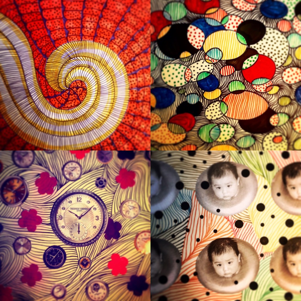
This work was executed using cut out stencil and origami paper. Although they are colourful and fun, it did not resonate exactly how I want to present my Parallel Project.
Research suggested on Report 5:
Ellen Gallangher ‘Deluxe’ at TATE at: , https://www.tate.org.uk/art/artists/ellen-gallagher-9553
Ellen Gallangher is an African-Amercan artist who works with painting, drawing, film and video. Her ethnic background reflects a fair amount in her work. There is issues of race and racial stereotypes imposed by our society. I see Gallangher work a product of a lot research and investigation. She brings back images from the past and how it influenced the present as well her own personal view of subjects. Her experimentation and exploration with material results in unexpected results and I believe this is one of the aspects in her intentions. Gallangher brings her space and abstraction in working with elements, using cut outs, pasting, layering, printing, carving as well as video and sculputures. These are all aspects used to create a narrative. In her “Deluxe” work for example, she used cut outs of magazines from 1930′ through 1970′, glitter, gold leaf and coconut oil which is associate with african hair. This materials combined with collage and digital technology, show the meaning and importance of the african culture in America. Deluxe adresses questions of beauty, gender, changes, personal expression and cultural identity in sixty individually printed frames.

Deluxe by Ellen Gallagher 2004/05

Deluxe by Ellen Gallagher ,2004/05
In her work, Bird in hand 2006, is a poetic narrative with detailed and density to the story she tells. Ellen Gallangher rescues the past and retell stories through her perspective, exploring techniques in methods in art to deliver and engage interest in the viewers.
Jackie Kay ( 2007) ‘Souls of the sea” of Ellen Gallangher on Guardian at : https://www.theguardian.com/books/2007/apr/28/art

It is hard to view her paintings online. Gallangher’s work is composed by layers and different materials which might have a completely different impact seeing live. Online I enjoy the piece put together. I can see newspaper, cut out magazine photos, drawn lines and monochromatic combinations that fits the subject of African American culture.
Bridget Riley at : https://www.artsy.net/artist/bridget-riley
Bridget Riley at TATE at : https://www.tate.org.uk/art/artists/bridget-riley-1845
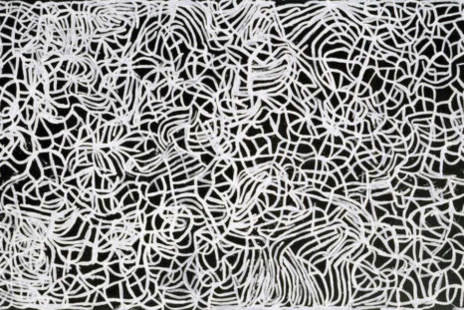
Bridget Riley is an English painter, know by her singular OP black and white paintings. Although Riley start with the pointillism technique, her later work was developed by drawings and painting that creates optical illusion. They are very meticulous work but for some reason, many of them seemed to have an hypnoctic effect, overwhelming and tiring for the eyes, specially the black and white ones. The coloured ones, presenting good combination caused me the sense of dizziness.
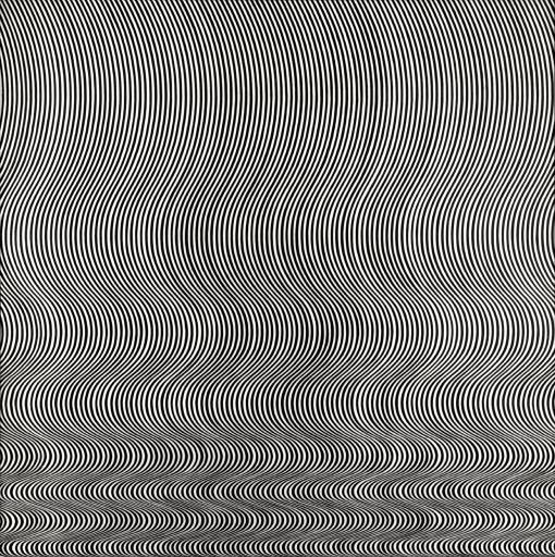
Fall by Bridget Riley – 1963


Reflection on Assignment 6:
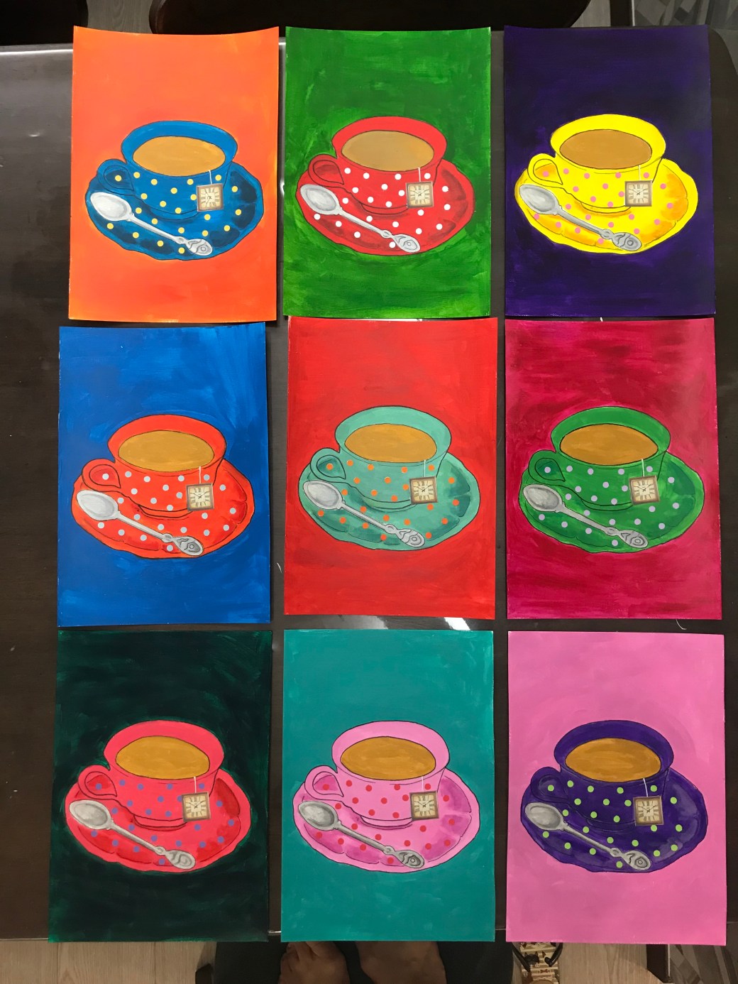
This Last assignment is a series inspired by Andy Warhol entitled : ‘ 9 cups of tea’. I have a first attempt to execute my idea on my PP tab but in the end, it didn’t resonate what I want to express. This is what I wanted. Bright bold colours, simple and feminine. That’s why I have chosen the tea cup object. It symbolises in paganism the Goddness womb. It is an object that reminds me my grandmother, mother and me as a mum. It was decorated in polka dots in homage to Yayoi Kusama, an artist I admire so much. I like when my art is very expressive but I also enjoy doing meticulous and carefully executed work. It brings me a good sense of effort and satisfaction . My first trial is also playful and colourful but I think my choice of using patterned background made it too busy. My stensils in thick black lines lacks the drawing element I wanted. I like them for being more diversified and fun but this last choice has more of context. In my critical review I have listed the artists who inspired me but this time my focus was Andy Warhol. Since we are on lockdown, the only way I managed to repeatedly copy the same tea cup was using a template of the image in baking paper. I copied it by re tracing the mark it leaves on the acrylic paint sheets. Each sheet is a A4 size, painted with acrylics and the tea bag detailed is a clock collage. It would have a better result and sofistication if painted on canvases and if I was able to go out, I might would try and finding out if the images could be printed on the canvas before painting, so it would be more uniform in terms of positioning and lines.


Feedback on Report for Assignment 6
I am very pleased with this report. I have had a lot support from Diana Ali and she has helped me finding a direction to what resonates with me in my art. I followed all her advise and I have been reviewing some new and late work to make amendments or to keep using some elements that works well for me. There is always room for improvement and this module has been very insightful in terms of points about my art I have to consider such as in keep reasearching and linking my work to artists that inspire me , think more about context and increase the amount of sketches in order to come out with better work.
Selection for Formal Assessment :
To start my Parallel project, I have cut out stencils of objects in thick watercolour paper. They are small, about 7cm height x 5cm width. The reason I needed this size is because I want to use origami paper as background and they are all 15cm x15cm.


I have tried a couple stencils but I think I have to make a decision of either keep patterned objects and plain background, or plain objects and ONE type of pattern. In this trial, I think the ‘cake’ image is just too busy.
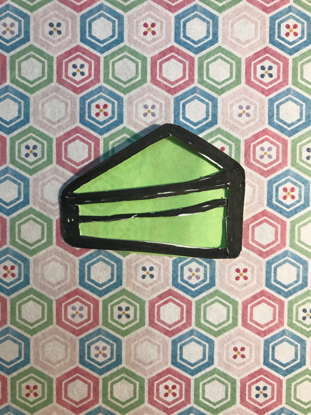
For instance, the ‘cake’ image, I would choose this pattern and simply change the colours of the centre subject.


Artists who inspired me for this Assignment:
Romero Britto at: https://en.wikipedia.org/wiki/Romero_Britto
Romero Britto is a Brazilian artist, painter, serigrapher and sculptor, who lives in the USA since 1989. Coming from a very modest family from Pernambuco (Northeast of Brazil) he has developed a great sense of being creative using what was available around him, from cardboards, used paper and anything he could use for his artwork. Britto’s became known when the reinveted the bottle of absolut vodka. Millions of people saw that. His art is associated with pop art and cubism. Britto’s work is vibrant, busy and full of energy. Looking at his work is like looking at a Latino interpretation of Pop art blended with cubism. His work inspired me in the use of bright colours versus pattern.
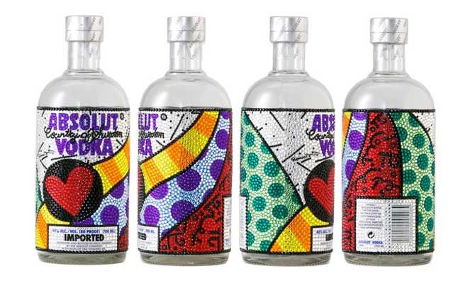
Absolut Vodka labels created by Britto, Romero
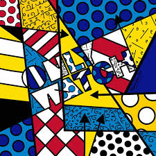
image by Britto, Romero
Jones, Jonathan(2001), The night stuff, Louise Borgeois at TATE – The guardian 9 jan 2001 at : https://www.theguardian.com/culture/2001/jan/09/artsfeatures1
Louise Bourgeois was a French-American artist and sculptor who created a series of drawings called ‘Insonmia’. Her drawings were of shapes, human figure and also patterns. Red is a predominat colour in this series. Bourgeois is well known by her magnificent size sculpure called maman, a spider that represents her mum. She was a remarkable artist who succeeded in the art world during 1940′,50′ when it was mainly dominated by male artists. Among drawings, paintings, installations and sculptures, Bourgeois main subjects were family trauma, the feminine, sex… Her work has a intense presence of emotion and energy.


The other three artists who inspired me for this assignment are Yayoi Kusama , Andy Warhol and Emily Kame Kngwarreye. The research on these artists can be found on my PP post of ‘Researches on artists who work with repetition’ and Kngwarreye research is found in Contextual focus point, part 4, project 3.
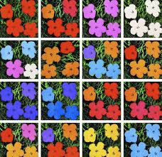
Flower printing by Andy Warhol – 1964
work by Yayoi Kusama
Big Yam dream by Emily Kame Kngwarreye
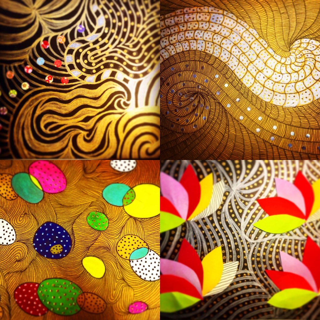
All these drawings are in size A3 sketch paper and canvas textured paper. The patterns were designed with markers, metallic paint,acrylic paint and cut out from coloured paper.
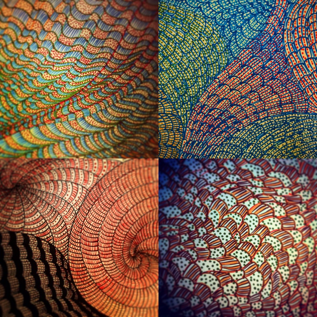
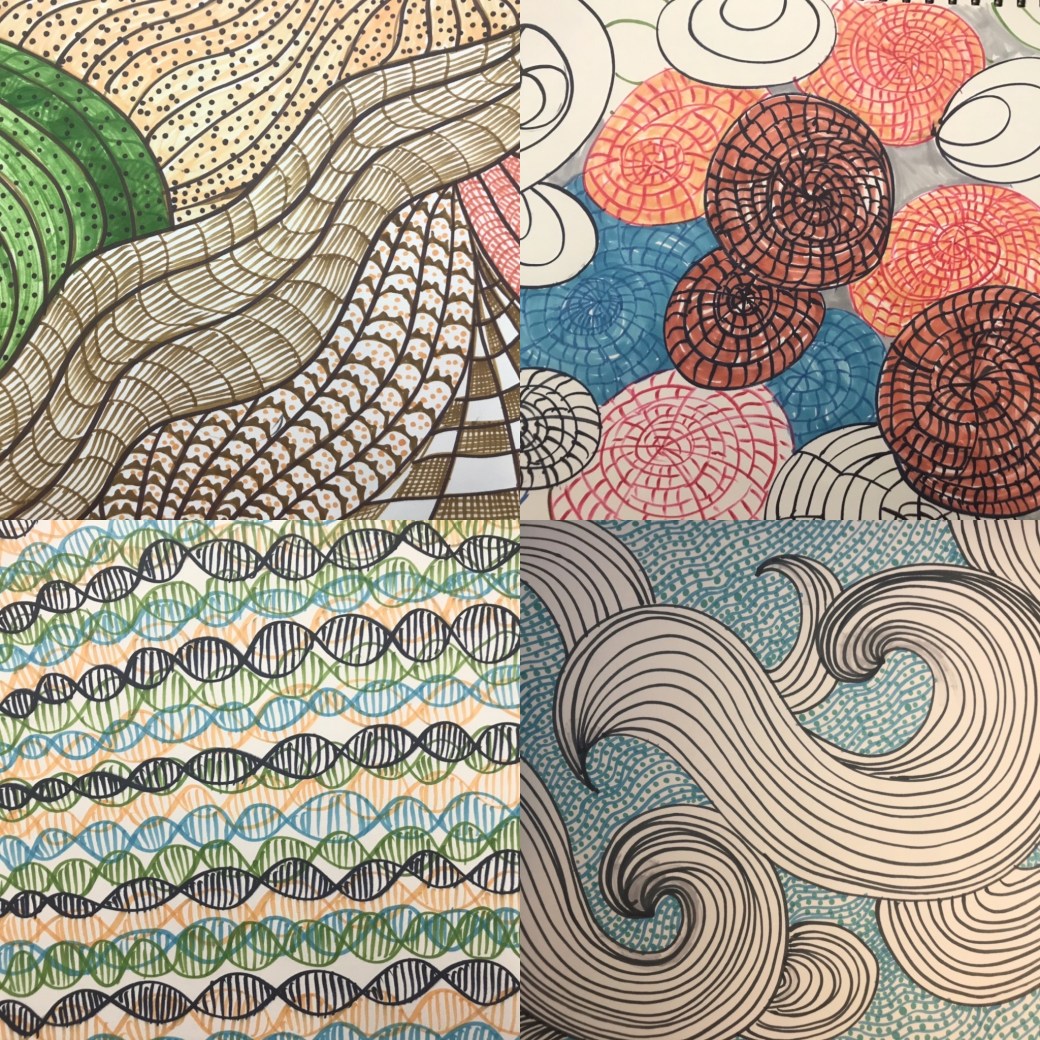
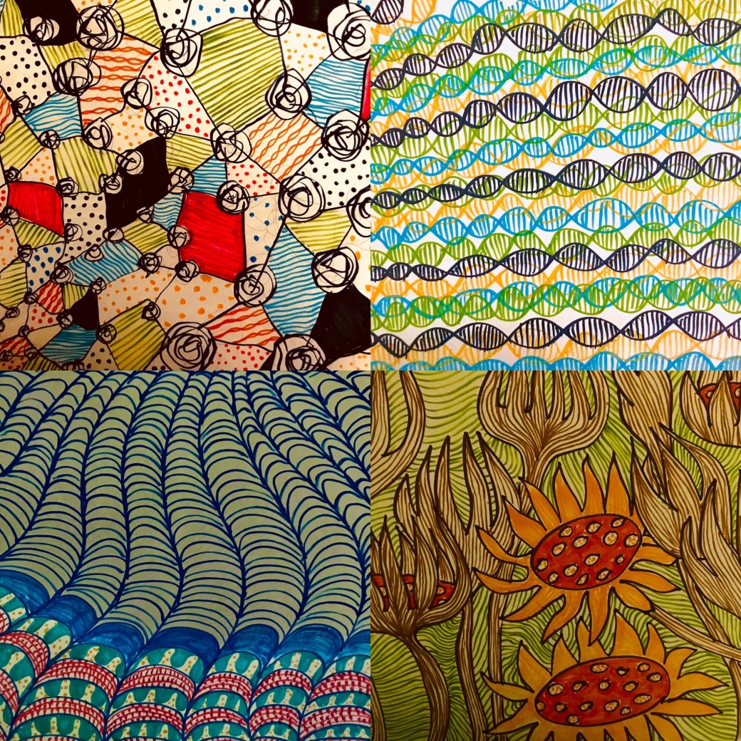
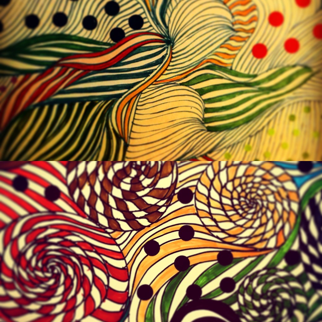
Being on lockdown has not been easy for anyone. I had made different plans for this Assignment but everything has changed since March 18th, when I became allowed to leave the house once a day to go for groceries. Part 5 of this module, was not an easy one to start with. The most difficult Project was Project 2: An artist’s book, however I received an excellent feedback from it! I might over think about some of the projects. Instead of just go with my guts, I cannot avoid worrying if I am meeting the success criteria in each task, and if I will achieve my credits to pass. I have even contacted my tutor Diana Ali to help me a bit more and she gave me great advise. It is not the first time she tells me not to overthink, and just do it, to not to follow the instructions in the module so strictly. After a lot research and reading about artist’s books, I think I finally decided to relax and keep doing, experimenting and exploring my ideas more freely. Despite the fact that I struggled to execute the first artist’s book, I found out how much pleasure is to do something that evolves through a certain period of time. I need to mention here that ‘Time’ is something that I have always craved for when it comes to my artwork, something that I never had enough due to day job, house chores and looking after my two children. At this moment, I have plenty of it and I want tobe as productive as I can . I had to mention Project 2 because after that it seemed that everything started to flow better. I finally passed that phase of being stuck and worried about doing the right thing. I just kept doing things, kept producing within the instructions I understood but bending these instructions slightly, to suit how I work. Using time to explore and create new work has proven to be very rewarding. Time to plan, time to try and make mistakes and time to execute it. The subject ‘time’ has also triggered many thoughts and ideas.Right at this moment in everyone’s life around the world, time has become so plenty and yet, threatening . My initial plan for Assignment 5 involved a construction site. I have recorded it through photos the last month or so. How I would executed it, I didn’t think much about. I was focused on a subject and literally in finding something that would ‘elapse’ over a certain amount of time. Now I can’t go out of my house to check on this site. I have photographed it, but I still wanted to go back and observe the final changes. I am home, stuck, with plenty of time on my hands to come out with something else I can do within my environment. Since the first day of lockdown I have become very anxious and restless. I feel for my children and family, I worry about the whole world and our future in it. I can’t sleep most nights. I am awake till 3am every day. The first couple nights I spent two hours just drawing. Not planning anything, until one night I started drawing patterns. The first one came out quite nicely.
I just enjoyed doing these patterns, it relaxed me and I know in my subconscious it might have to do with my researches for my PP; to link my work to the work of Andy Warhol, Yayoi Kusama or Louise Borgeois and other artists who worked with ‘repetition’. Patterns is about repeating elements in an artwork and repetition has taken over my work and my everyday life , in a regimented way. It is not that we do not live in repeated moments .Most of us wake up everyday, and do very similar things to keep up our own routines. I suppose I have start perceiving ‘repetition’ in different angles . The repetition as in how I want to present my PP, which I will discuss when it is ready, but it also has taken another route for this Assignment in representing boredom, routine, consistency, subconscious thoughts, flow and as an emotional practise. Drawing patterns had become a way of dealing with my restlessness, the way Louise Bourgeois has used in her series of drawings called ‘Insomnia’. It became a way of exploring my ability in working with lines and creating different images with them. I have being inspired by Andy Warhol, Yayoi Kusama, Louise Bourgeois, Allan McCollum, Britto Romero and Emily Kame Kngwarreye. Some of these artist’s researches can be found in my PP post. Louise Bourgeois, Emily Kame and Britto Romero will be included in this Assignment’s page.
I have developed a series called ‘Insomnia’, inspired by ‘Insomnia drawings’ by Louise Borgeois. I have started this series on the 18th of March.. Some are beautiful, others are boring, heavy, or too busy to look at. Some are conceptual and some purely emotional. Some are also unfinished as it all relates to how I was feeling on each day of sleepsness nights . I have tried them in different techniques, methods and materials. It has elapsed from simple patterns to more sophisticated and intriguing ones. I am presenting this Assignment five with 21 pieces of work. Overall, this course has helped me enhancing my abilities in working with different materials and techniques. It has broaden my knowledge in drawing and how to react and represent my ideas in relation to my environment, feelings and perception. I believe I am starting to find my voice in my work.
Feedback on Report for Assignment 5
I am very pleased with this report, specially because I am coming to the end of this module. I completely understand Diana’s comment on trying not to make some drawing ‘pretty’ by colouring or making changes as sometimes they work as they are. It is true, I sill worry about doing something wrong and not seeing as a good work although I spontaneously do some work that seems that the spontaineity is exactly what is working! I am also glad I am improving in terms of context and concept. It is not completely clear yet, I don’t know If I can do it in every single work, but it makes more sense and it is better to work on something when I have in mind what I am trying to represent. My assignment was successful but I understand what Diana means by maybe adding some collage elements would make it look more interesting than be just patterns. I will take a look again and see how could I modify some of them. Overall, this is a good report and I am considering all the advises in order to improve for the next coming Assignment and Module.
I followed my tutor Diana Ali suggestion and add some collage elements to some of my pattern work. I think it made them more interesting rather than just pattern work.
Warhol, Andy biography at : https://www.biography.com/artist/andy-warhol
ASX, (2015) Prince of boredom in: ASX (17/12/2015) at: https://americansuburbx.com/2015/12/prince-of-boredom-the-repetitions-and-passivities-of-andy-warhol.html
Andy Warhol was an American artist, film director and producer who started his career as a successful magazine illustrator from the 60′ that is known by the iconic Campbell’s soup advertisement which was an allegory for consumerism ( mass production, big business and etc). After that he start doing the same type of images with other mass production products such as coca-cola and then celebrities. His method was to silkscreen images and produce it over and over again showing that even in repetition an image is never exactly the same, and there is no such thing as perfection .Andy Warhol strongly believe that artists should be able to change their styles and I think his repetition was also a way to say that. In many ways his repeated image show the fluidity of life in terms of same things happen daily in our lives but it is never exactly the same way. Repetition is not precise at all. We have routine demands such as eat, sex and sleep but it doesn’t mean it will be precisely the same although it is repeated over and over again.
Audrey V, Silka P and Angie Nordic, (2016) ‘Repetition in art’ in: Widewalls 24.08.16 at: https://www.widewalls.ch/repetition-in-art-artists-photography/


TATE (2012) exhibition of Yayoi Kusama at: https://www.tate.org.uk/whats-on/tate-modern/exhibition/yayoi-kusama
Yayoi Kusama is a Japanese contemporary artist who spent over 60 decades dedicated to her work. Her trademark the motif polka dots which she has used in drawings, paintings, installations, sculputures and video art. She made to New York when she was in her 20′, when New York artworld was dominated by male in 1950′. Kusama always knew what she wanted to do in art and how she wanted to achieve it. Although she has always suffered from mental illness, her obssession with dots as a motif and painting constantly without much rest; resulted in a productive habit. Her repetition using the same motif over and over shows no barrier between, where they could be placed,no matter the subject environment in space or size. She just kept doing it and still does even now in her 90s’. She channeled her trauma in a creative way. In her installation “aggregation” where furniture and a boat is covered by penises, was her own way that repetition took place to release trauma, the uncomfortable feelings related to sex and the male genital. In my opinion, Yayoi uses repetition as an intrinsic way of let go everything unwanted inside her.


Allan McCollum (2016)[user generated content online] Creat.National gallery of Art, 30/06/2106 at:
Allan McCollum is a contemporary American artist. He tried to show through “Plaster surrogates” , in a single object what we tend to collect. His repetition shows that all sorts of painting can be hanged in our wall but not only paintings. Items and others objects. The frames are also an illusion of frames as they are molds he casted in plaster and kept making more and more of it in differents sizes and colours for over a period of 10 years. The paragraph bellow is taken from my Assignment two in module two for Understanding Visual culture module.
The concept of ‘Plaster Surrogates’ is not about a piece of art but a representation of all sorts of ‘collectables’ people tend to purchase for their homes. McCollum did not intend to represent commercial, vulgar things but in keep creating a fair amount, it created a relationship with the rise of Capitalism during Modernism. This phenomenon resulted in a compulsive consumption in big quantities. I also personally believe in another meaning of the ‘Plaster Surrogates”. The ones framed as ‘black painting’, seems as an allegory of how consumerism became an act of gather in quantity rather than being selective for quality. We are pursuing for the impulsiveness of it without realising it might be already there.
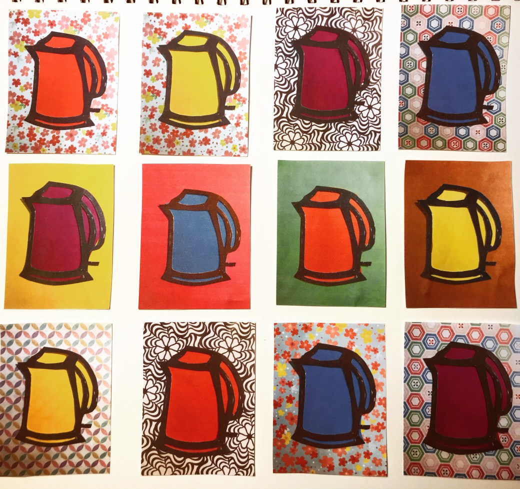
At the moment I am working on Part 5, project 4 in a piece that is taking me a fair amount of time. I can’t explain yet why and how the idea came up but it is entitled “a 100 cups of tea blends”. I am working on that everyday but for a break I keep going back to my PP and honing ideas and techniques I think would work well . Because of Project 4 on Part 5, I start to become very interested and fascinated with the idea of repetition. It is the first time I am doing a project in this method and it is giving me a feeling of joy and satisfaction despite the fact that it takes a lot time and focus, and I have been working on that over a week now. The idea of repetition gives me that sense of continuity, routine, discipline and fluidity. I have been researching about artists who worked and work with repetition and Andy Warhol is the most popular in this method. I also like the work of Yayoi Kusama, Magritte, Allan McCollum and I have found new artists who have been for different reasons, interested in “repetition”. I think I would like to link my PP to Andy Warhol, but for now, I am just having a try of what is to work with multiple, identical but in a way, different images. I am torn between the work of Scott William and Andy Warhol now. They are very different and I will have to decide soon.


I know the work of Andy Warhol was executed in silkscreen prints, something almost impossible for me to achieve in my living space. The idea is being inspired in his repetition methods. I cut out a template of an outline of a kettle. At first I tried to print it, but the paint sticks and dry very quickly on the stencil made of cardboard . The print becomes very irregular and fades away not achieving the result I wanted. I tried to paint over the lines printed but it also won’t give the printing repetition feel that I want. The identical and inadentical image repeated over and over again. 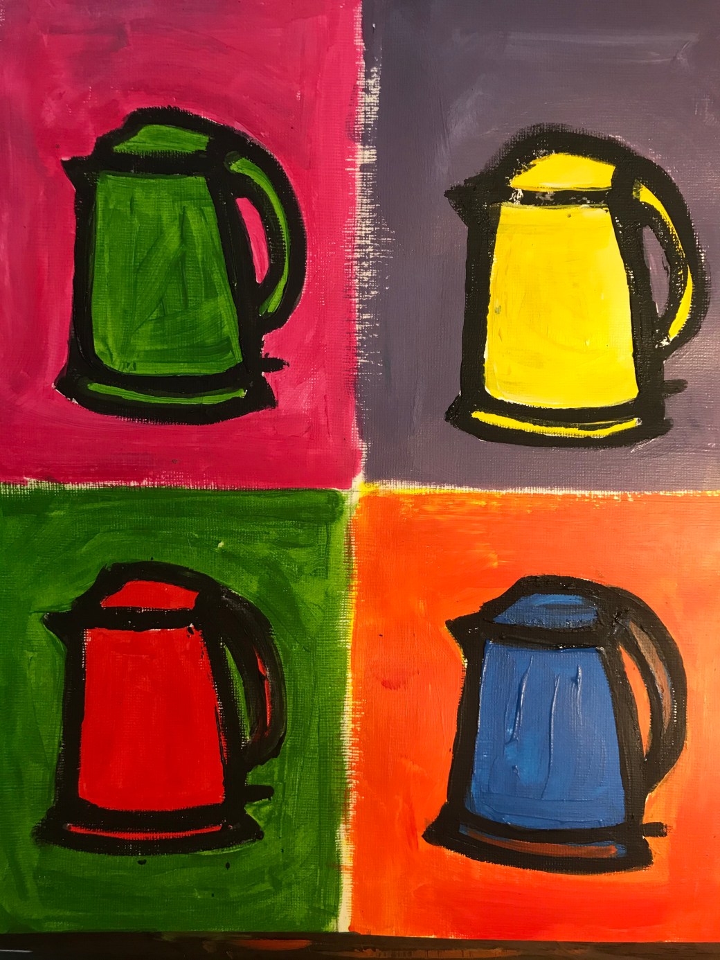
The acrylic paint almost gave the brightness in colour that I want but it is not what I had in mind yet. I would like to carve the outline of the kettle on a rubber plate, so I can print the image more clearly but I am on quarantine and all the shops are closed due to COVID-19. I am trying to explore what I can for now.
My next step was to use the stencil with two layear of papers underneath it. One for background and another for the kettle colour so I will repeat the same image over and over again without any touch ups by hand.
I like the result. My printer is not the best and I am photographing it with my phone but will discuss with my tutor Diana Ali , whatelse I can do to improve this project if I decide on linking it to Andy Warhol .


http://www.visual-arts-cork.com/famous-artists/frank-auerbach.htm
https://www.theartstory.org/artist/auerbach-frank/artworks/#pnt_5

E.O.W ( Estella Olive West) half nude portrait by Frank Auerbach

E.O.W ( Estella Olive West) portrait by Frank Auerbach
Frank Auerbach is a German/British artist born in 1931. Auerbach was brought to England when he was 7 years old during WWII. His parents stayed back and died in a Jewish concentration camp . Auerbach is known by his thick impasto brushstrokes technique in landscapes and his portraits. His style is considered to be Neo-impressionist. He has developed a deep and strong relationship with his art, in a way, how it happens with people. This is one of the reasons that he takes time in each work he completes. He gets to know his subject. He works with regular sitters who have posed for him for decades, one of them, Ms. Auerbach, his wife. His paintings consists in many layers of thick paint, becoming almost a piece between painting and sculpture. Like many post WWII artists, Auerbach has made a sharp distinction between figurative and abstract. He captures the essence of people in his portraits with concepts such as mutability and impermance. Auerbach records the chaos within the psychological state either in him, the sitter, or both. He tends to paint, scrape and paint over, again and again similarly, in the way we are and how we are constantly subjected to changes, biologically, mentally and emotionally. His portraits has traces of feelings that affected everyone during WWII, a feature in many post war artists. It is heavy, dense and affectionate. The difference in his work between photographs and life paintings is the ability he has to capture the subject, his perception and reading of the environment or the person who poses for him. It would not be possible to have the same energy and view if it was a photograph, a 2D still image. He has his sitter and him there , in different sessions, feeling differently, in a different time, over long periods of time . These factors are essential to the production and result of his work.
” If you pass something everyday and it has a little character, it begins to intrigue you” Frank Auerbach
The Boyle family – piano nobile at : https://www.piano-nobile.com/artists/1171-boyle-family/biography/
https://www.artsy.net/artist/boyle-family
The Boyle family (2010) [user genereated content online]Creat. TATE shots 15 sep 2010 at:
Mark Boyle was an artist born in Glasgow, Scotland. He married Joan Hills and after they had their own children, they named the project Boyle family that describes collaborated work with family and their community. The project first called ‘Planet earth” start in 1968. They use earth material and their environment to show interaction, exploration and investigating the meaning of them. From Hills, rocks and sea. They show in a poetic way taking elemental studies to be observed, felt and understood through various mediums. It a journey to questions our environment and our function in it. How the world changes and how we change this world. I think The Boyle family forces us to look into details and places that we don’t hardly notice by isolating this pieces out of its environment. It shows beauty, roughness, weight or lightness and the feel, necessity or purpose of them within us. At the same time how nature acts upon us.
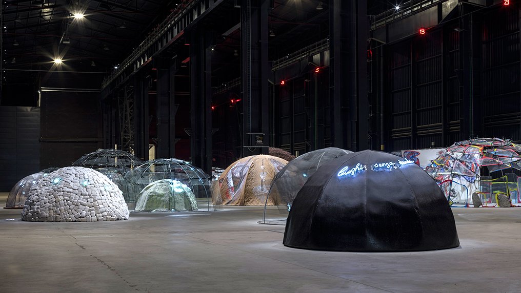
McKever, Rosalind(2018) ‘The enigmatic igloos of Mario Merz’, Apollo Magazine, 7 nov 2108 at: https://www.apollo-magazine.com/the-enigmatic-igloos-of-mario-merz/
Mario Merz was an Italian artist associated with art paver ( literally meaning poor art). He was imprisioned in World War II when he start drawing. Merz began to develop deep interest in architecture and in 1968 he started his igloos’s project going through the 80′ and he kept doing till his death in 2003. The igloos are made with a combination of man made structure and natural materials. From stones from Brazil to twigs, rock, glass, they vary in materials from all over the world. Very interesting the exhibition on Tate’s in 1985, entitled: Do we go around houses or do houses go around us? Food for thought. Merz main motif for his art is a mixture of political, economical and environment context. It can be seeing as perceived by the viewer. It might mean, refugees shelter for some, security and protection for others, poverty, defense, the need to protect the environment due to the natural materials he uses, protest, use of space and individuality.
work by John Goto
Friedlaender, Linda . Reynold-Kaye,Jennifer and Skipton, Long (2018) John Goto’s ‘ High Summer’, Yale center for British art, 6 April 2018 at: https://britishart.yale.edu/exhibitions/art-focus-john-gotos-high-summe
John Goto is a British born photographer who has an interesting way of blending figures in photographes of sites in the past and people of the present in a satirical and surrealist manner. His photographes are a travel on time, questioning places, our actions, how we fit or not in our society and world.
Aim: Make a drawing which forces the viewer to use time differently. This may mean a drawing which takes time to make sense of or a drawing that creates a feeling of certain pace. The drawing may need an investment of time by the viewer in some way. A drawing is a record of the time you spent making it, but the viewer also spends time looking at it. perhaps seeking meaning, enjoying its beauty or marvelling at the artist’s skill.
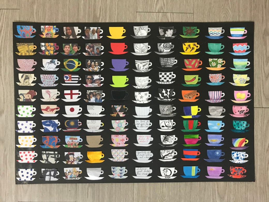
‘My hundred blends of tea cups’ by Katia Setsuko


Reflection: The viewers I had (mostly viewed this over the phone due to lockdown), but I had my children and a friend looking at it. Most comments were that it was like telling a story, a narrative about myself. Many admired the details and patience in cutting each cup individually and the variety of patterns and subjects in them. I have chosen a cup of tea as a start of a conversation. In many places around the world people start a conversation over a cup of tea, or coffee. The cup of tea simbolizes taking the time to listen, to talk, to look at things together.A cup of tea is always an invitation to relax, enjoy reflection time alone or with friends. It is comforting, joyful, meaningful. It is a ritual done alone or in a group in many cultures around the world. The cup itself is also relevant to some people. Some like in a mug, or a pretty cup, or a pottery special made tea cup like in Japan. The cup can be special for many reasons: a gift from someone, the imprint in it, the material made of, the brand, the size… My narrative is about myself and my path through life and art. From markers, to watercolour, chinese ink, pencil, charcoal, soft pastel, oil crayon, acrylics, origami paper, writings, photos of my loved ones, places that matter to me, where I come from, textures, artists that I admire mostly and patterns…. They might be too busy, too much to read. If I had to do it again I would have done different selections of objects such as tea pots, tea cups, mugs, cups, and each selection would approach a different narrative: subconscious expression, people, feelings, concepts of art etc. This piece of work is just who I am. Many things wonders in my mind at the same time, all the time. There are many things I like, many things I talk about when with friends.
