In helping me to decide what I would like to develop in this project, my lovely tutor Diana Ali, asked me a few questions such as: what do you really like to do? What does make you feel like you want to draw? What is Something you are passionate about?
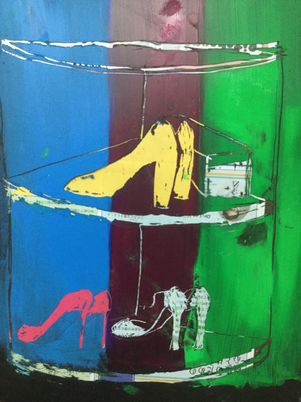
Well, there are so many things I like drawing and painting and I am passionate about and although I haven’t found my voice in art yet, I wonder if I will ever be consistent in my art. The choice of subject for my drawings or painting is always influenced by the moment I am living. Sometimes it is about feelings or people and sometimes about what is going on around the environment I am living in or simply about emotions I can’t explain. Right now I enjoy experimenting drawing and the process, more than be consistent to a specific topic/subject. For this project I have chosen ‘ domestic life’. The reason is because I am unemployed and spending most of my time at home. Despite the fact that I need and miss a job, I love staying home. I enjoy looking after my children, cooking and organising my place. My home at the moment is nothing like what I wish it to be. It is a rented place, fully furnished. All the furniture, fixtures and most objects were not chosen or bought by me, but it is still my home for now. I just tried to added a few small changes and little things to make it cozy and more personal. I try to recreate in my drawings the warm feeling of my home, no matter how it looks like. Being at home most of the time, makes me feel a bit isolated from the outside world but I don’t mind. I like my ‘home world’ and I have a very intimate relationship with it. Through this project I am trying to depict how I feel about home and to turn into art ordinary household appliances, objects and everyday simple situations such as how my dishwasher or how interesting and intricate my iron wire can be. I want the viewers to experience through this project my personal approach to domestic life and how I see beauty in simple objects such as a plant pot placed in a certain area of the house, or the cat under a chair or on the couch. In order to achieve that ,I started searching for artists who are known by painting ‘domestic life’, ‘still life’ or ‘landscapes’. Among many, my favourites ones are:
- John Bokor
- Anne Redpath
- Anthony Green
- Matisse
- William Scott
Researches on Artists who paint domestic life, still life and landscapes
https://www.talkingwithpainters.com/2016/09/29/ep-8-john-bokor/
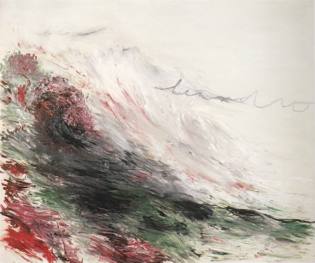
John Bokor – Australian artist award winning for landscape and still life painting. What has brought interest in John Bokor’s paintings is the use of bright colours, spontaneity , emotions and lively energy he transmittes in everyday life situations. It is what I am trying to capture for my project but in my own personal way of seeing things around me and how to relate to the close environment. Painters such as Pierre Bonnard and Van Gough were sources of inspiration for John. He uses carbon pencil for most his sketches, something I haver never tried. Through the website above, listening to his interview and watching his videos, I found out his process and tecnhiques very helpful and motivating to start my project . John Bokor shows the importance of sketchbooks in capturing scenes, re work in images, invent, add or remove pieces when working on a final piece.

Hot chocolate – Oil on linen by John Bokor

Kitchen sink – sketch by John Bokor
https://www.nationalgalleries.org/art-and-artists/artists/anne-redpath
Anne Redpath– Scottish painter (1895-1965) knew by her domestic life, still life paintings. Redpath considered Matisse one of her inspiration and her use of patterns in the background reminded me of some Matisse’s work. Her paintings are expressive, colourful and calm. Redpath uses perspective in a similar way of post-impressionist painters. In some of her paintings I feel a certain formality and solitude as well as the feeling of home and tranquility. Many of her still life with flowers are bright, and there is no much dark/light contrasts.

Still life with Red tulips by Anne Redpath
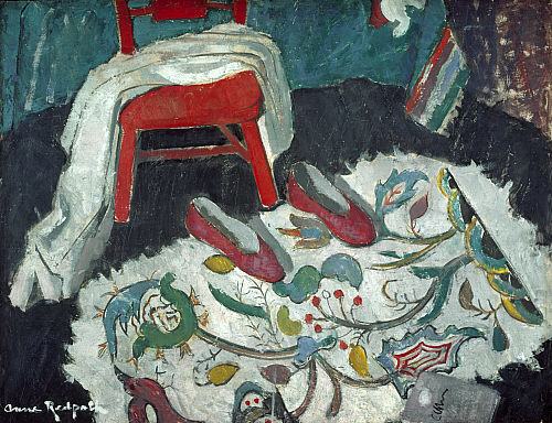
The Indian Rug by Anne Path (1942)
https://en.wikipedia.org/wiki/Anthony_Green_(painter)
Anthony Green- English painter, known by his own middle calss domestic life and unusal perspective of polygonal forms in large irregular shaped canvasses. His subject is mainly chornicles of his family and surrounding private life. In additon to his unique way of using perspective in his work, what fascinates me when looking at Green’s paintings is the warmth, passion and love in his domestic life. There are so many painting of moments of intimacy with his wife which are revealing and erotic but at the same time innocent and sweet. I like his interior descriptions of the english home feeling with ornaments, rugs and differents patterns in the background.

Anthony Green, 1939

Chinese Lantern by Anthony Green – 1974
https://www.theartstory.org/artist/matisse-henri/life-and-legacy/
Henry Matisse– French post-impressionist painter(1869-1954) , sculptor and printmaker. He is known by bright colours, patterns, interior scenes, still life, nudes and Landscapes. Inspired by painters such as impressionist Van Gough and Paul Cezanne, Matisse was the precursor of Fauvism and one of the greatest artist of the 20th century. His still life and interior paintings are emotional and strong. His cut outs towards the end of his life shows his passion and innovative ways of keeping doing his art. I am very inspired by some of his compositions.


http://www.artnet.com/artists/william-scott/
William Scott -British painter (1913-1989) and influenced by Georges Braque and Paul Klee, Scott abstract paintings are flat and use limited colours palette. His still life paintings are abstract but still with a fair amount of description in forms and shapes. He founded an Art school in Pont-Aven in 1937 when he lived in France, lectured in Bath Academy of art and met Jackson Pollock, Franz Kline and Mark Rothko when he visited US in 1953. His paintings have an interesting use of space , flatness and I like the simplicity in how he describe domestic life objects and lines.

Brown still life by William Scott (1957)

Still life by William Scott (1973)
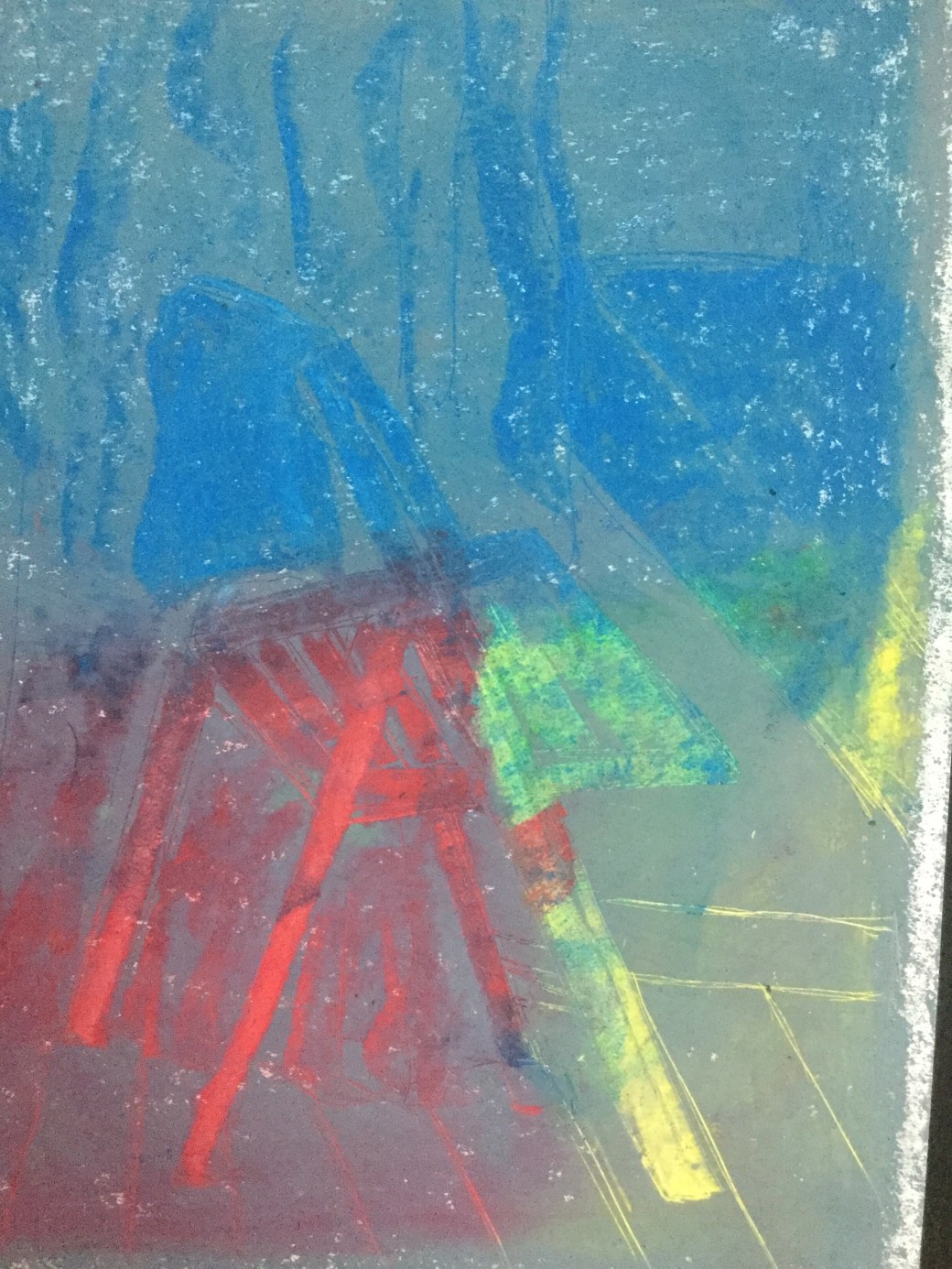
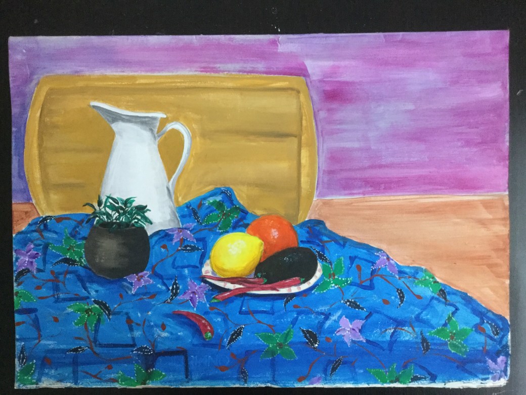
Sketch book samples:
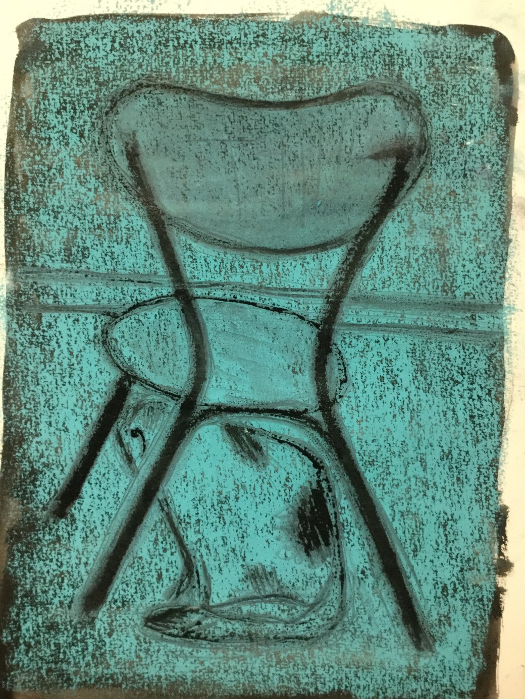
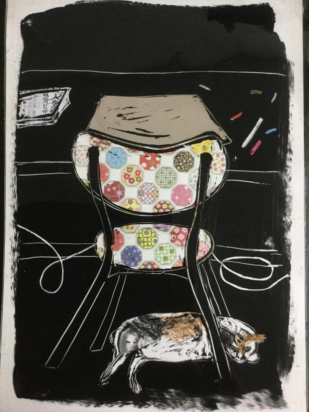
I try to go around the house almost everyday to sketch rooms, furniture, objects and situations I find interesting. I hope to have enough for a selection towards the end of Assignment 5 so I can have a clearer idea of how and what I want to present for this project…
Me, objects, environment and views of domestic life
While doing my research about the artists I chose and are known by their work on domestic life, still life and landscapes, I am thinking about trying to define how I look at objects, what drags my attentionto them, what feelings and emotions I would like to put into my work when it comes to home and my drawings and paintings for this project.
I was born in Brazil, from Brazilian mother and Japanese father. I grew up in Sao Paulo but when I was 19years old I moved to Japan for 5 years. I came back to Brazil when I was 24years old and soon after I met a British man who became my husband and father of my two children. I married when I was 30years old and lived in England for one year before moving to Malaysia. For the entire time I was married ( 10 years) I visited England twice a year and became very interested and familiar with English culture. Although I love Malaysia and it has been my home for 15 years, besides my connection with my home country and second home country which is Japan, England has a strong influence in who I am today. Malaysia is where I live, it is beautiful, warm and welcoming but I still struggle with the culture and religion. I lack the sense of belonging here.
When I think of these four cultures that influenced my upbringing, married life and adult life, I want to use all I admire in each of them to add to my artwork and choice of subjects.
Brazil– childhood memories, music, my roots, modest home, the smell of fresh coffee and cakes, sunny days and home drama!
Japan– food, language, art, discipline, simplicity and wisdom .
England– Tradition, formality, celebrations, family oriented and cozy homes.
Malaysia – Colours, spices, friends, diversity and exotic fruits.
In conclusion, I am trying to depict the domestic life I have experienced through these cultures. Using some objects, subjects and imagery that evoke certain feelings and emotions. I would like to try describing it simple but colourful and emotional. I want to present to viewers a personal narrative of what ‘home’ means to me.